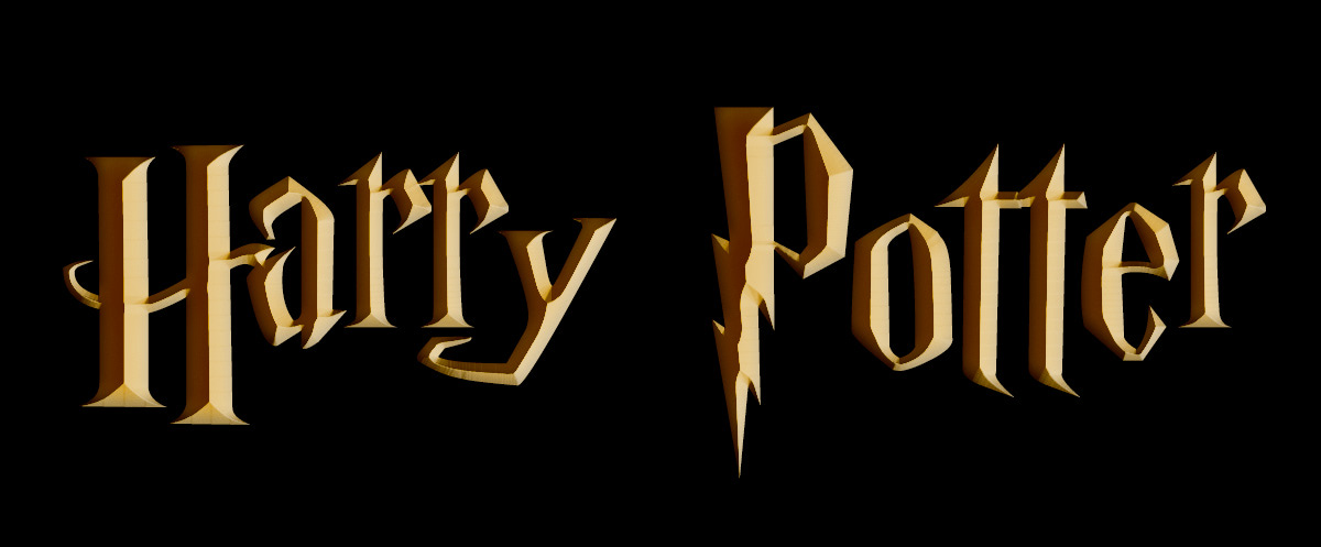
The Harry Potter logo is so iconic and has represented the boy wizard since it first appeared on the Sorcerer’s Stone jacket artwork back in 1998. Today we’re going to learn to recreate the logo — lightning bolts and all — so that you can use it in your own creative projects.
What you’ll need
1. Adobe Photoshop
You’ll need a copy of Adobe Photoshop to work along with this tutorial. If you’re getting into graphic design, Photoshop is offered via a subscription model for around $20 USD a month.
2. ‘Harry P’ font
For this tutorial we’ll be using ‘Harry P’, the earliest and most popular fan recreation of the official Harry Potter typeface. You can download a free copy of ‘Harry P’ over on our fonts page.
Photoshop ready? Font ready and installed? Wand, er, mouse at the ready? Let’s begin!
1. Create the text
The first thing you’ll need to do is create a new Photoshop document and a text layer using the ‘Harry P’ font. Create a ‘File -> New’ document of whatever size is suitable for your project and add your text. To see all the glorious logo detail, bigger is better.
2. Add some colour
Next, we’re going to add some colour to the logo. The Harry Potter logo has evolved quite a bit over the years to match the ever-darkening tone of the ‘Potter’ films. In this tutorial, we’re going to use the classic gold/bronze shading.
Select the text and change the colour to #c49329.
3. Layer styles
This is where the magic really happens. We’re next going to apply a bunch of Photoshop layer styles to create the logo’s dramatic bevel and shadow effect.
Open up the layer styles palette by double clicking the layer or by selecting ‘Layer > Layer Style > Blending Options…’ from the menu.
Inner Shadow
Select the Inner Shadow tab and copy these settings:
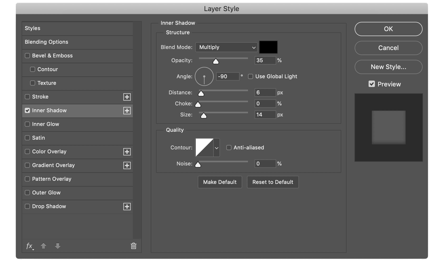
With the Inner Shadow settings applied, your logo with look like this. It’s starting to look very reminiscent of the US edition cover artwork, isn’t it?
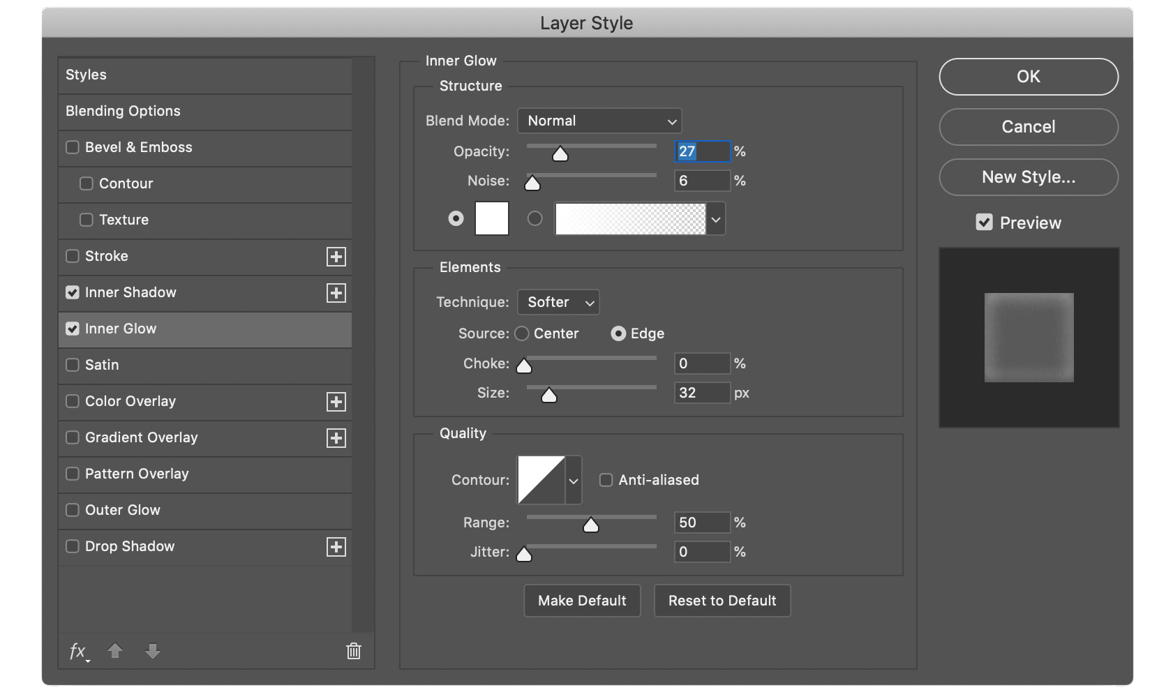
Inner Glow
Next, apply these Inner Glow settings:
Bevel & Emboss
Finally, apply these Bevel & Emboss settings:
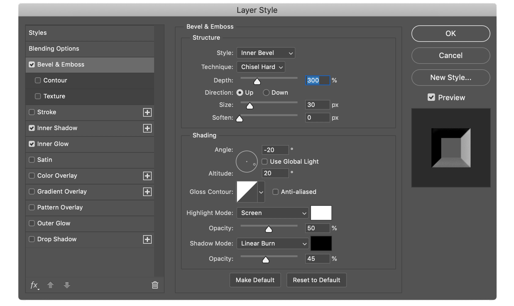
With the layer styles applied we’re very close to the final ‘Potter’ logo!
4. Noise and distortion
The final step is to add some noise and distortion to the logo. If you look closely at Warner Bros.’ version of the logo you’ll notice all kinds of artefacts: noise, rust, scratches, imperfections etc.
This is the kind of step you could spend hours perfecting. For this tutorial, we’re going to add some basic noise and then apply some quick transformations to make it feel a little more weathered.
Create the noise layer
Create a new layer and ‘Edit > Fill’ the layer with solid white (#ffffff).
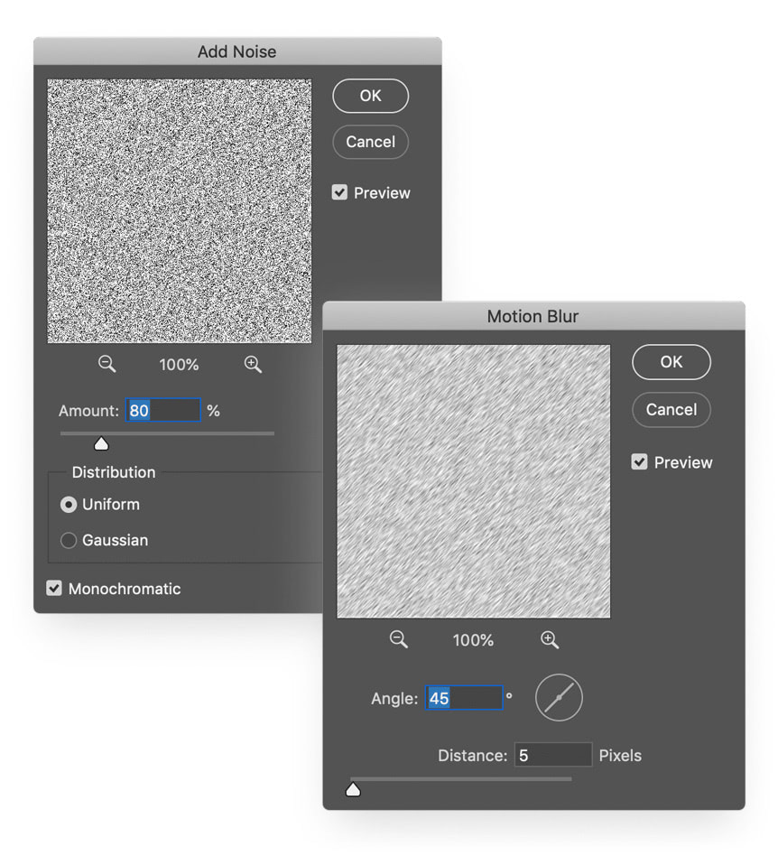
Next, select ‘Filter > Noise > Add Noise’ and apply the following noise settings:
- Amount: 80%
- Distribution: Uniform
- Tick Monochromatic
Blur the noise layer
Select ‘Filter > Blur > Motion Blur’ and apply the following blur settings:
- Angle: 45°
- Distance: 5 pixels
Blend the noise layer
Finally, blend the noise layer by changing the layer’s blending mode to Luminosity and the opacity to 30%. Then, alt + click (PC) or option + click(Mac) in the space between the two layers to create a layer mask.
The GIF below demonstrates this masking technique:
5. Take five and enjoy your work!
Well done, if you’ve made it this far then you have your own version of the Harry Potter logo! That deserves an Outstanding grade.
Taking it further
Once you’ve built the basic logo there’s plenty of ways to spice it up. In this example we’ve added some background elements, more shadows, and a few bits of ‘Potter’ iconography to the foreground.