It’s been almost four years since the last full-colour Harry Potter illustrated edition hit shelves, nearly twice the length of time between the original publication of Order of the Phoenix in 2003 and Half-Blood Prince in 2005 (it was a tortuous wait, I assure you). While Rowling powered away on the penultimate ‘Potter’ book for two years, Bloomsbury’s Half-Blood Prince illustrated release has taken a little longer to conjure, namely due to a bold change in artist. For the sixth illustrated release, Jim Kay hands the magical brush to Levi Pinfold to close out these beautiful companion books.
In late 2013, Bloomsbury announced plans to publish full-colour illustrated versions of the seven Harry Potter books. Mirroring the publication history of their source material, artist Jim Kay worked tirelessly to bring (more than) a splash of colour to the first three ‘Potter’ novels in 2015, 2016 and 2017, before tackling the gargantuan Goblet of Fire in 2019 and Order of the Phoenix in 2022, the latter including additional illustrations and embellishments from Neil Packer. The fifth illustrated edition is Kay’s last Wizarding World contribution to date, citing a desire to focus on his mental health. In apparates Levi Pinfold.
For those involved in the ‘Potter’ machine, British-born Pinfold (who now lives in Australia) is already a Harry Potter illustration alumnus. He provided the incredibly intricate artwork for all 56(!) of the 20th anniversary Hogwarts house editions (released between 2017 and 2021) and contributed artwork to both the Patronus on a Postcard project (2019) (Pinfold drew Snape’s Silver Doe Patronus) and The Harry Potter Wizarding Almanac (2023). In early 2025, the Harry Potter publisher announced that Pinfold’s unique artistic style would close out the illustrated Wizarding World chapter.
‘Like watching a firework display on the coldest, darkest of nights’
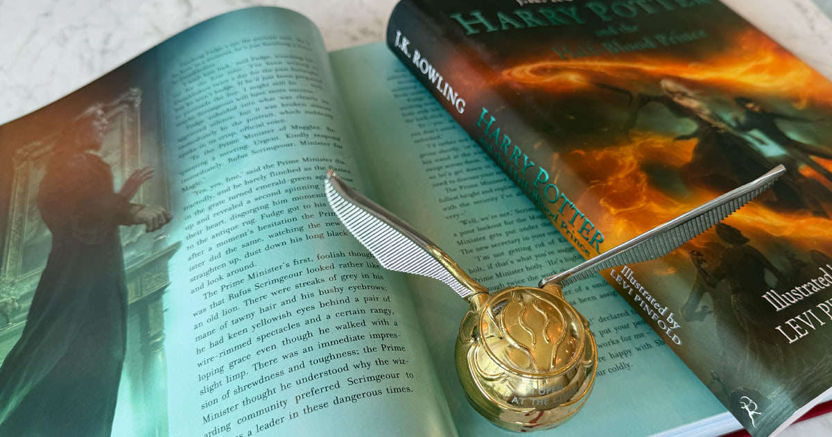
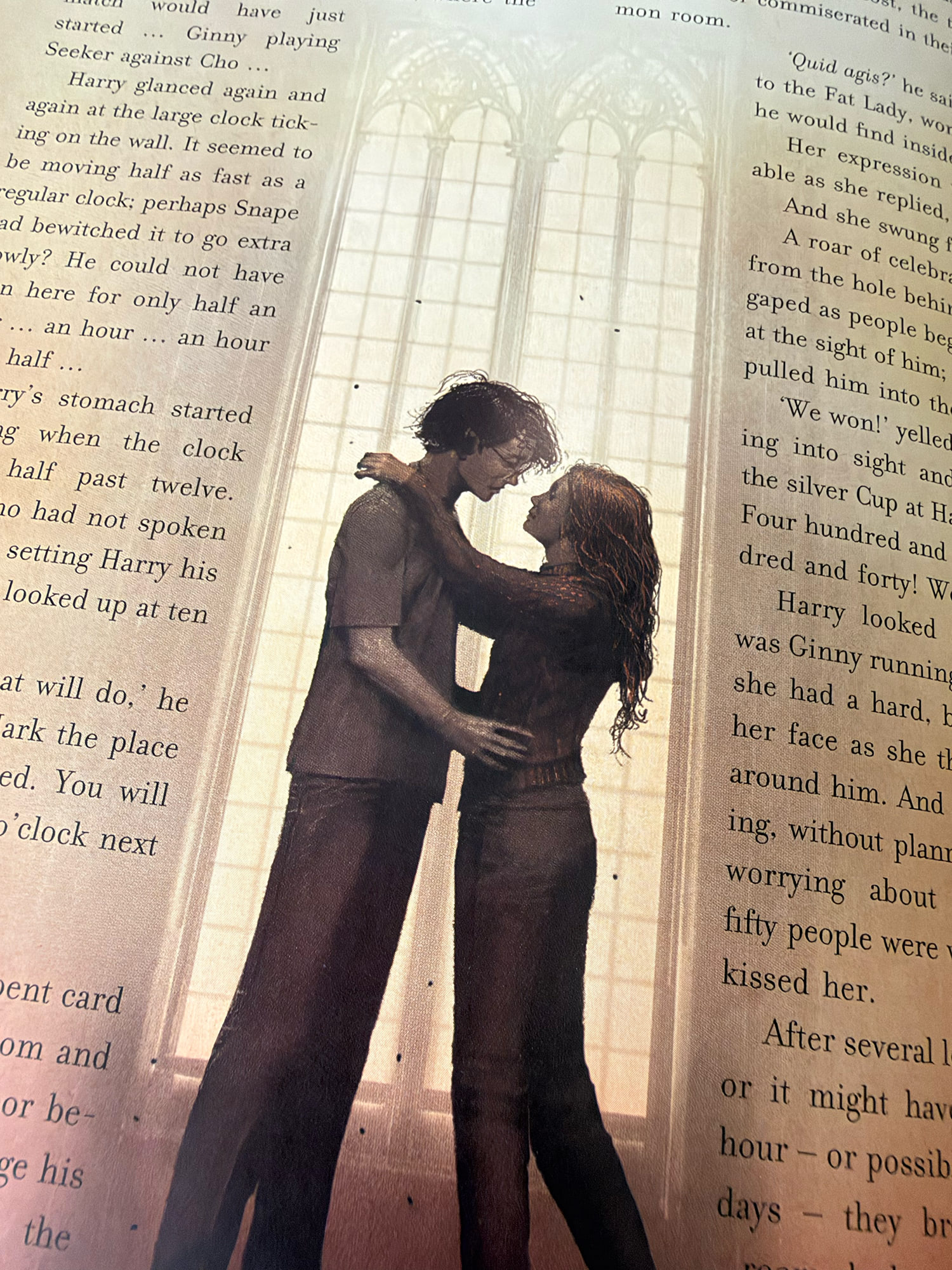
Before opening Pinfold’s Half-Blood Prince, it’s reassuring to know it feels like a cohesive contribution to the existing illustrated edition volumes. Similarly sized (more on that later) and bound, it’s adorned with Bloomsbury’s same embossed titling and is similarly typeset. Once you open the cover, however, you’re greeted with a double-spread interpretation of Pinfold’s Hogwarts Castle on the endpaper — and it’s clear that book six is nothing like its predecessors. There are plenty of adjectives and artistic verbiage one could use to describe Pinfold’s style, but the same word that’s been used for two decades to describe the source material seems fitting here: it’s just darker. Pinfold’s illustrations are hauntingly atmospheric and heavily stylised, drawn with muted colours, stark shadows and an incredible level of technical detail (Pinfold lovingly describes his work as ‘time-consuming’).
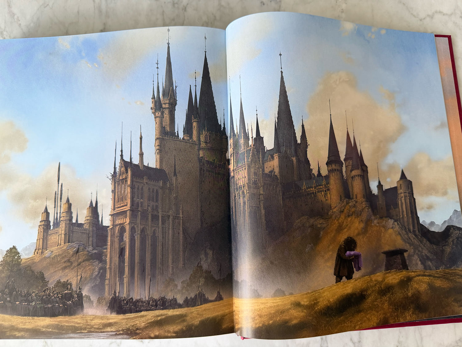
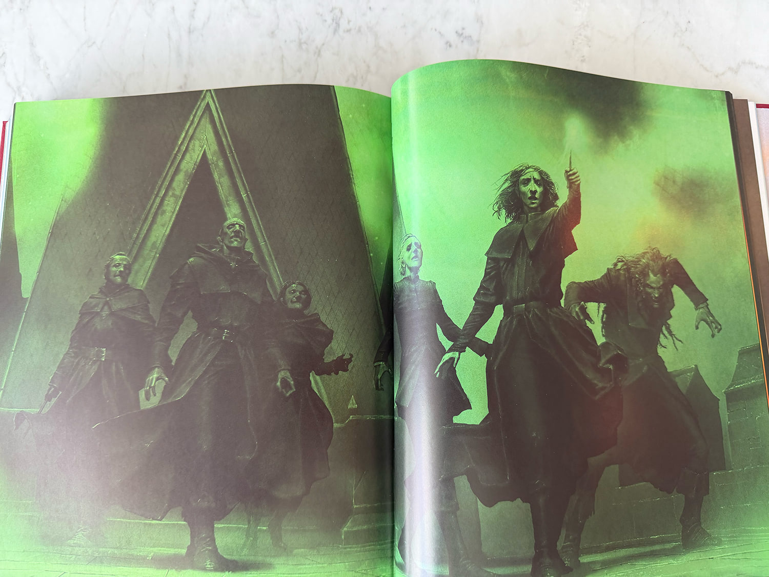
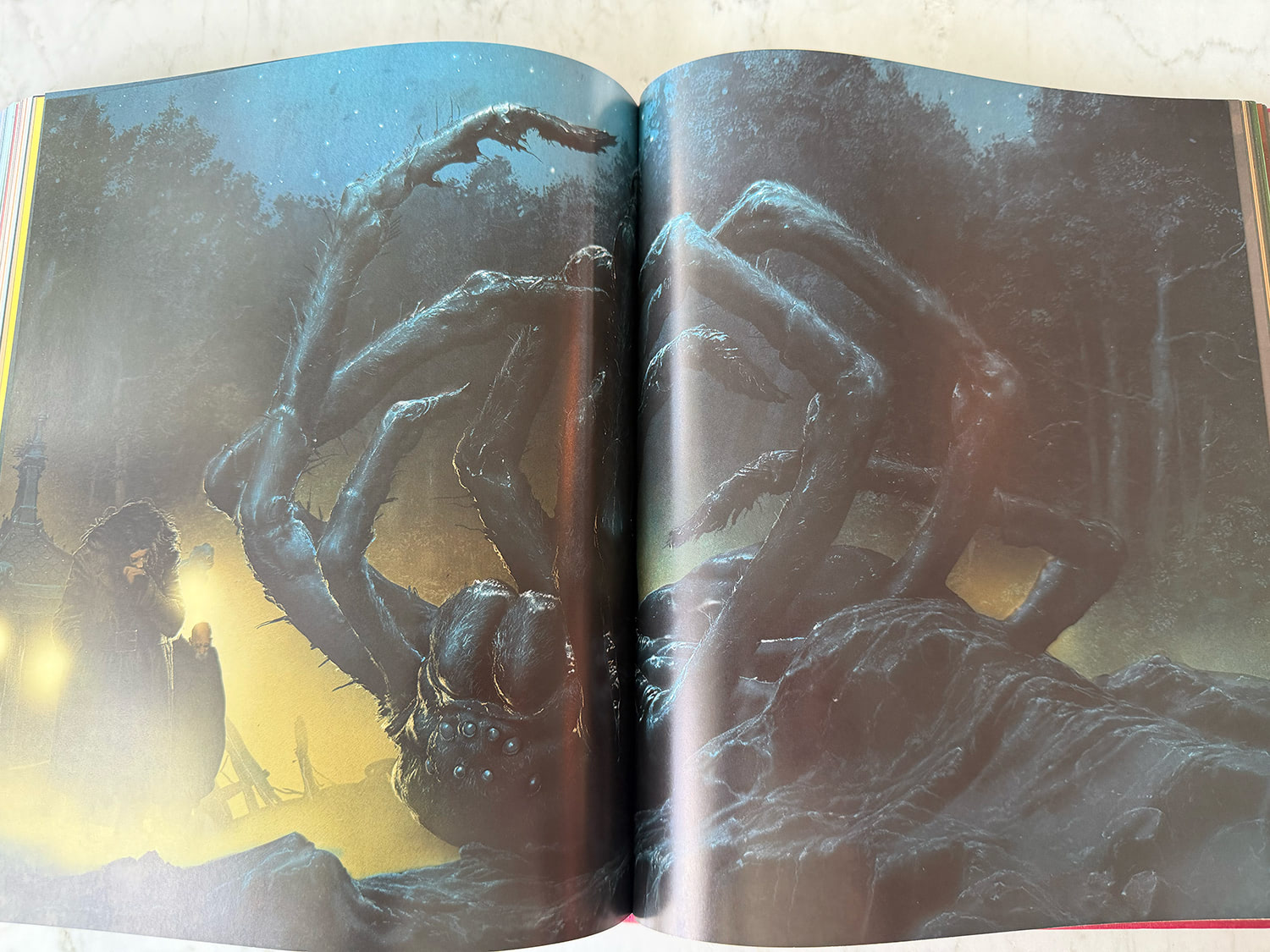
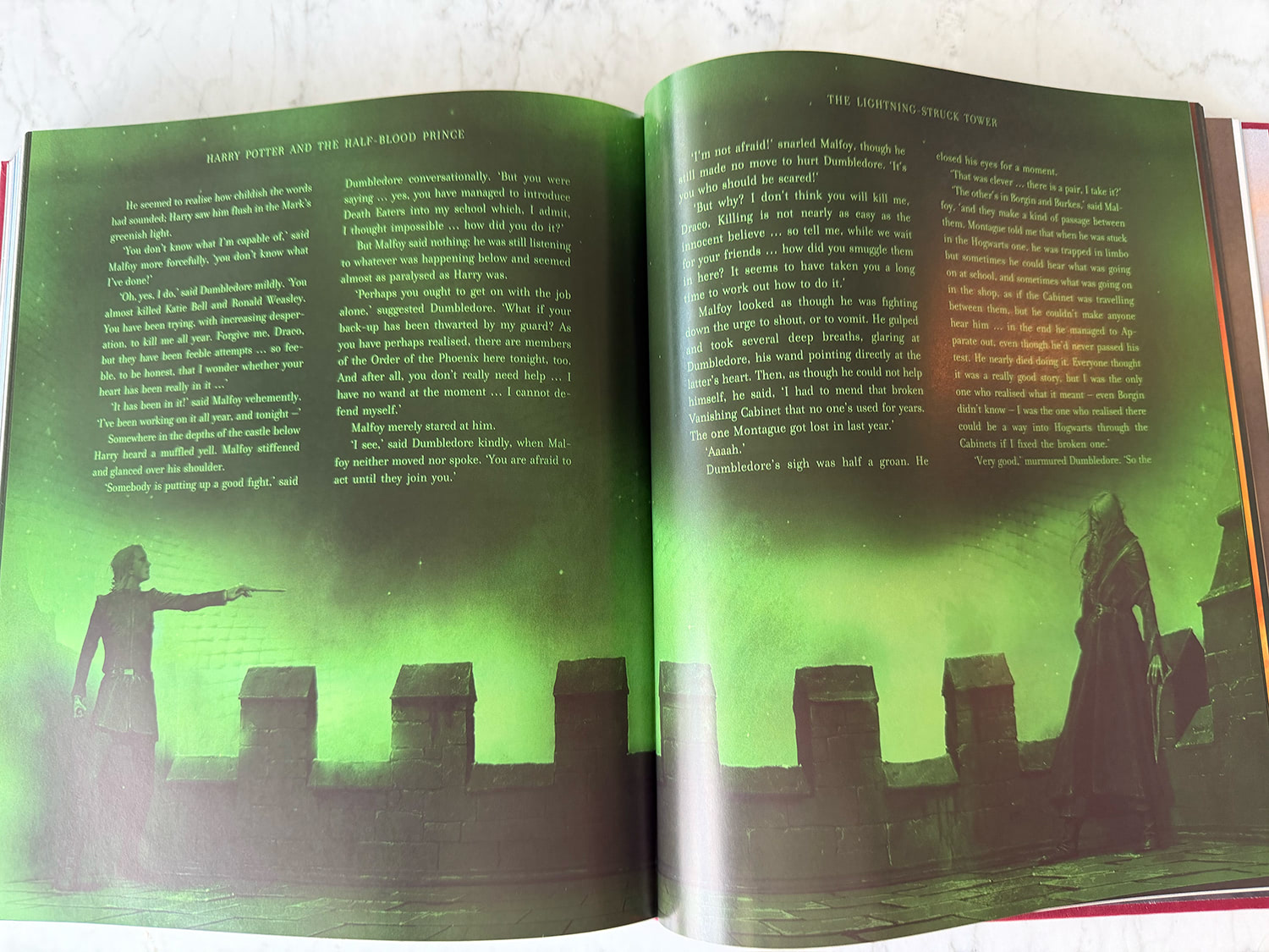
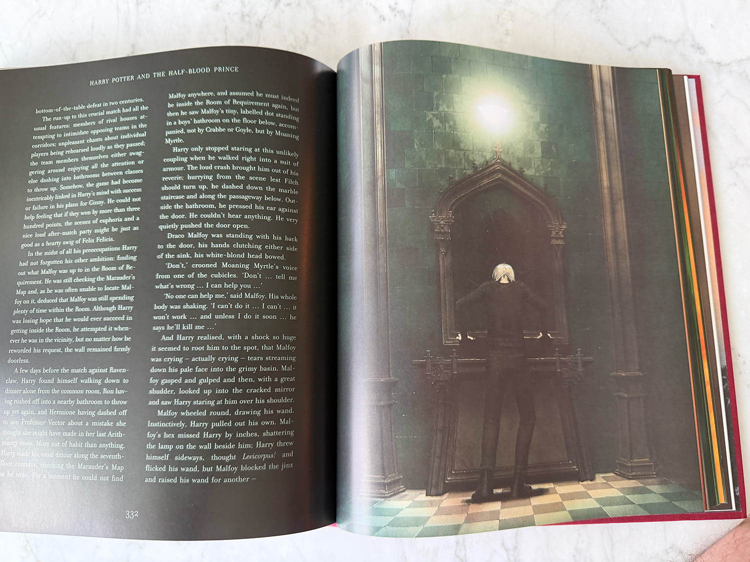
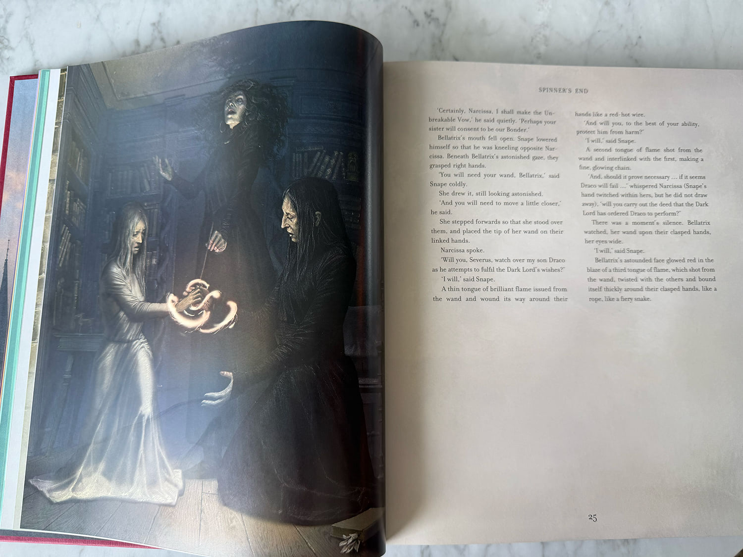
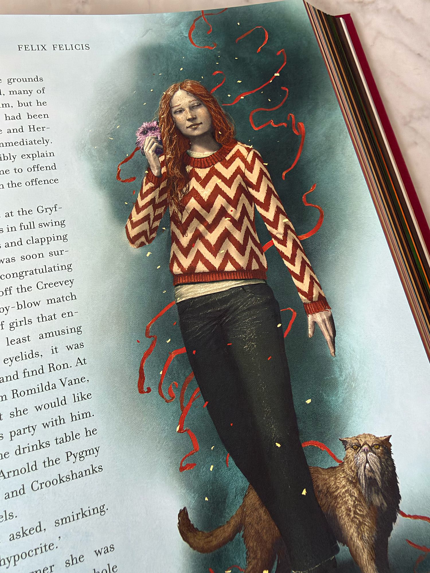
Pinfold’s stylised approach is most spectacular and striking in his outdoor scenes, the breadth of those compositions really immersing you in the story. He includes beautiful double-page spreads of Hogwarts Castle, Spinner’s End, Aragog the spider’s burial and the Death Eater attack at Hogwarts (the latter fittingly graded in signature Half-Blood Prince green). Pinfold’s unique character portrait contributions include the Potions master Horace Slughorn, Divination teacher Sybill Trelawney, a suitably tortured Draco Malfoy, Filius Flitwick and Minerva McGonagall, among others.
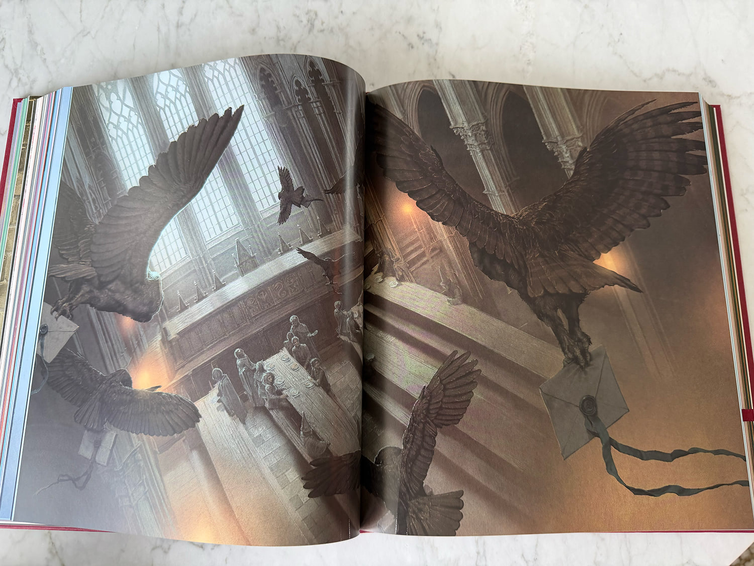
The Half-Blood Prince illustrated edition contains approximately 150 illustrations; not far behind Order of the Phoenix and roughly 35 more than Goblet of Fire. Size-wise, the book feels almost identical to Goblet of Fire in hand, despite being seven chapters shorter. Simply put, it’s loaded with more artwork. Every chapter includes at least one signature illustration, even if that’s just an embellishment or adornment nestled within the text. This is a significant improvement on its two immediate predecessors. Goblet of Fire had three chapters without a single piece of artwork, and Order of the Phoenix had large character-heavy sequences begging for artwork with only an owl or decorative envelope to remind you this book includes artwork.
‘I just loved the whole ‘book within a book’ concept’
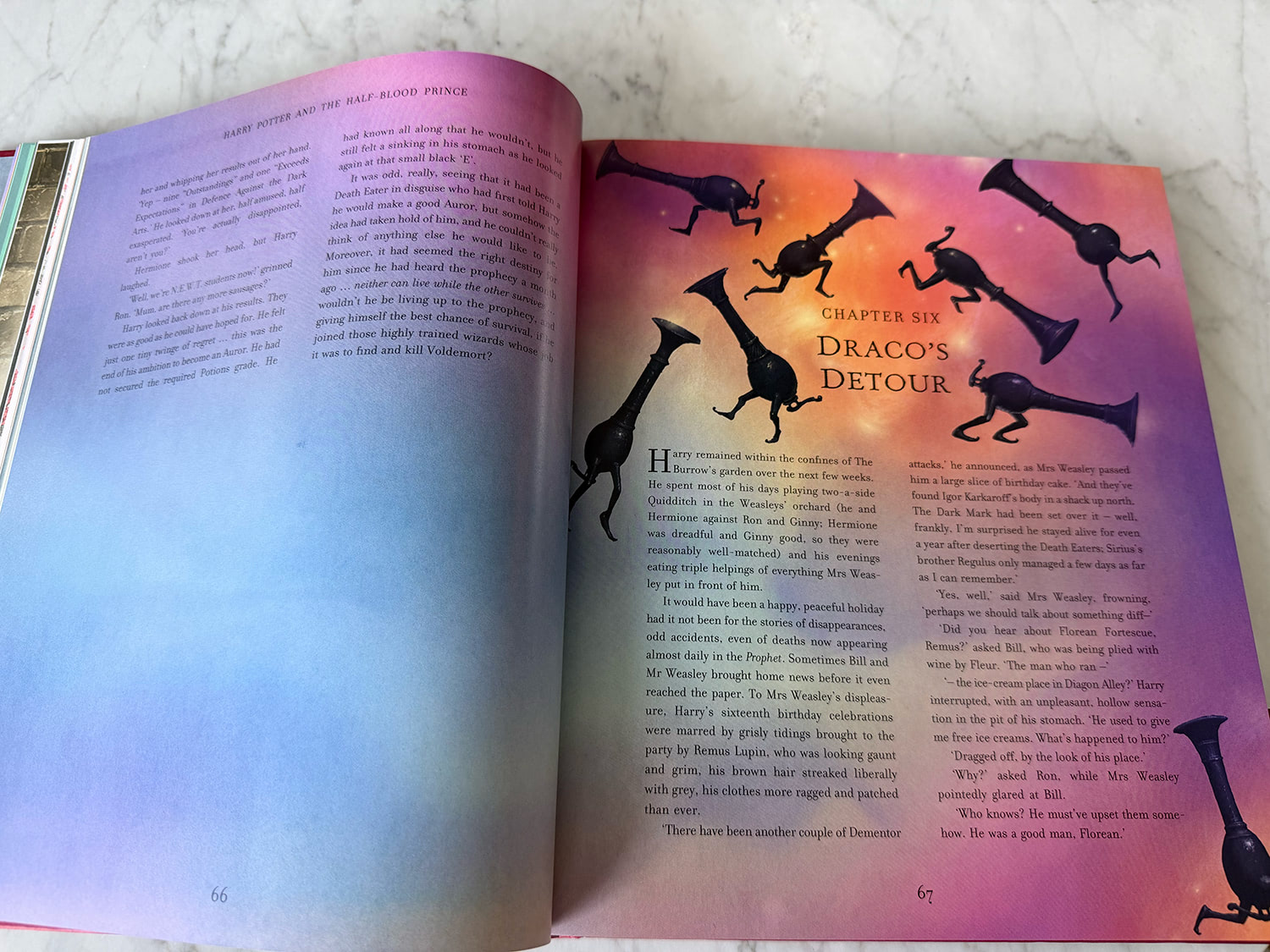
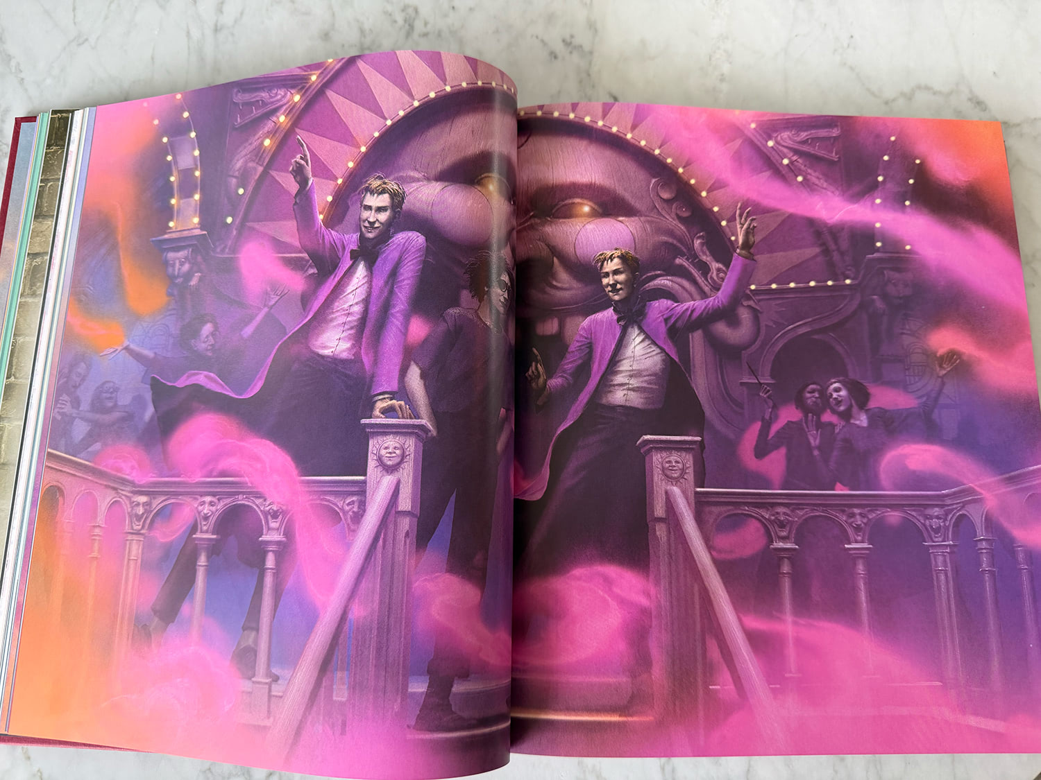
That immersion is taken further here with Pinfold’s ‘non-illustrated’ pages still feeling incredibly cohesive and propelling the story forward. While the previous illustrated editions all included darker chapters (largely black backgrounds with inverted text), Pinfold uses these incredibly effectively with beautiful sweeping gradients to tease and transition between scenes. The Weasley joke shop scene, for example, has three pages printed on beautiful atmospheric swirling purple-orange gradients which explode into a double-spread illustration of the shop. You know something magical is a page away. Later chapters transition through cool blues and purples, into warm reds and oranges, and finally into the book’s final cave and Astronomy Tower climax, which becomes increasingly represented by striking greens. (This really hits home if you turn your book on its side and look at the rainbow gradient made by the pages.)
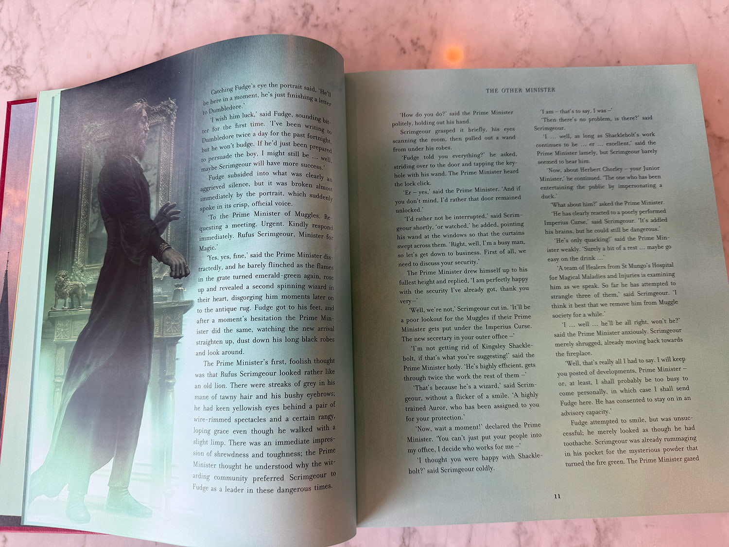
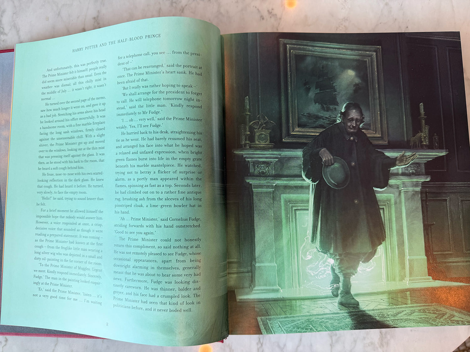
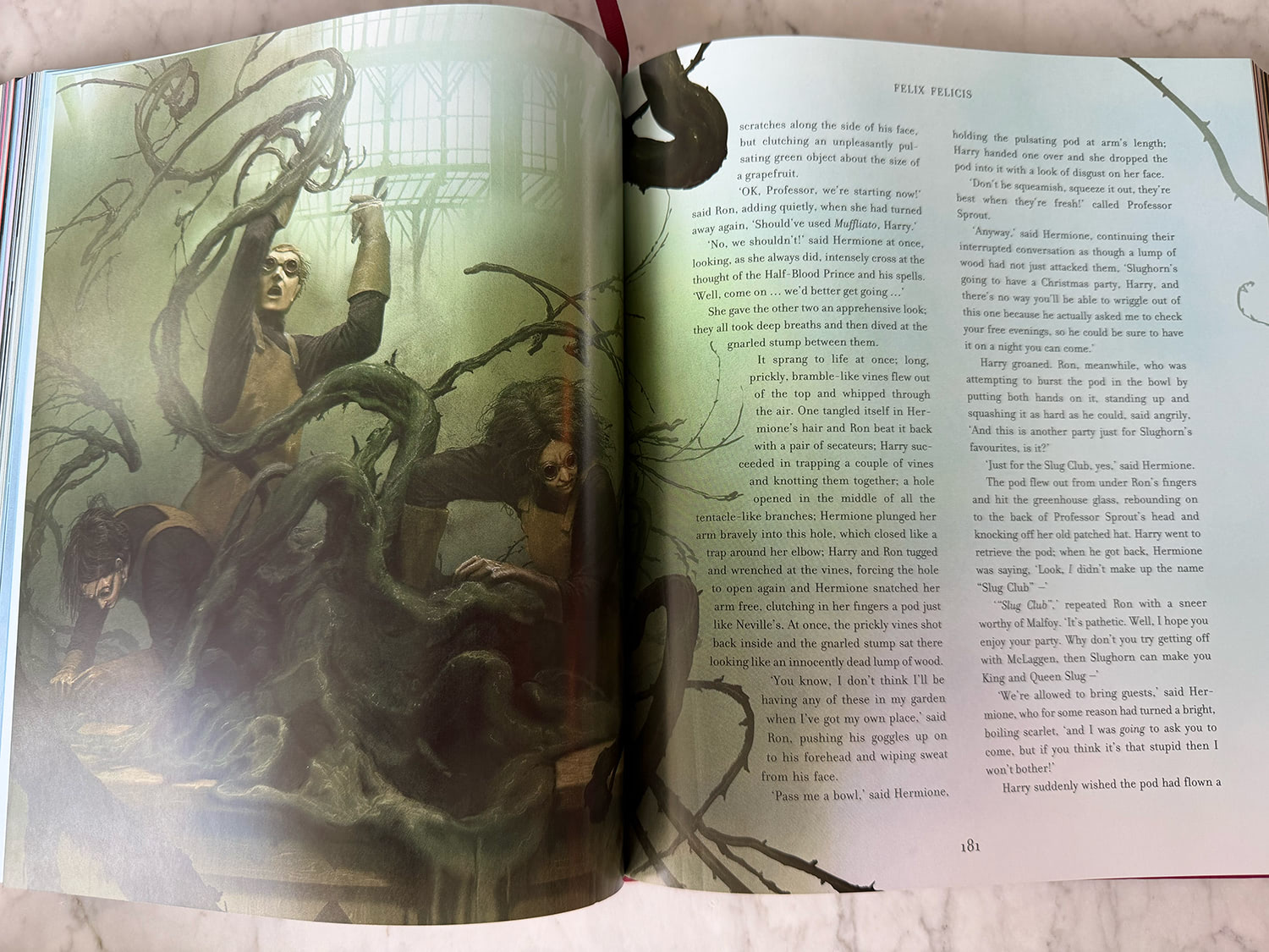
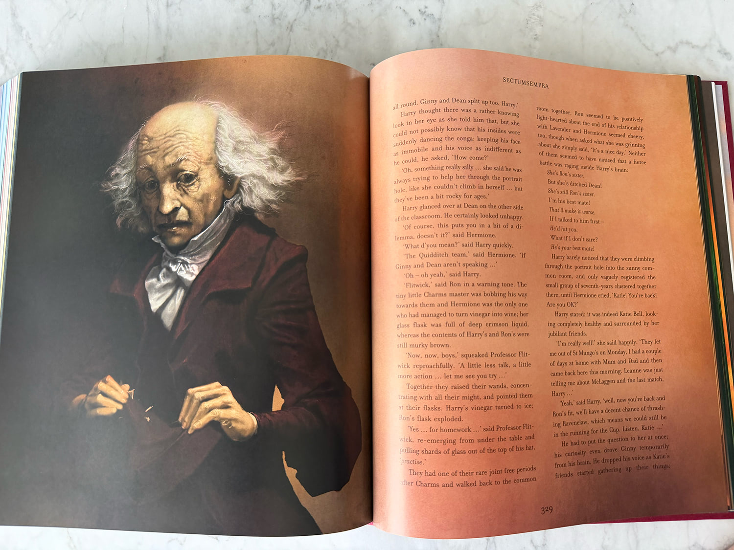
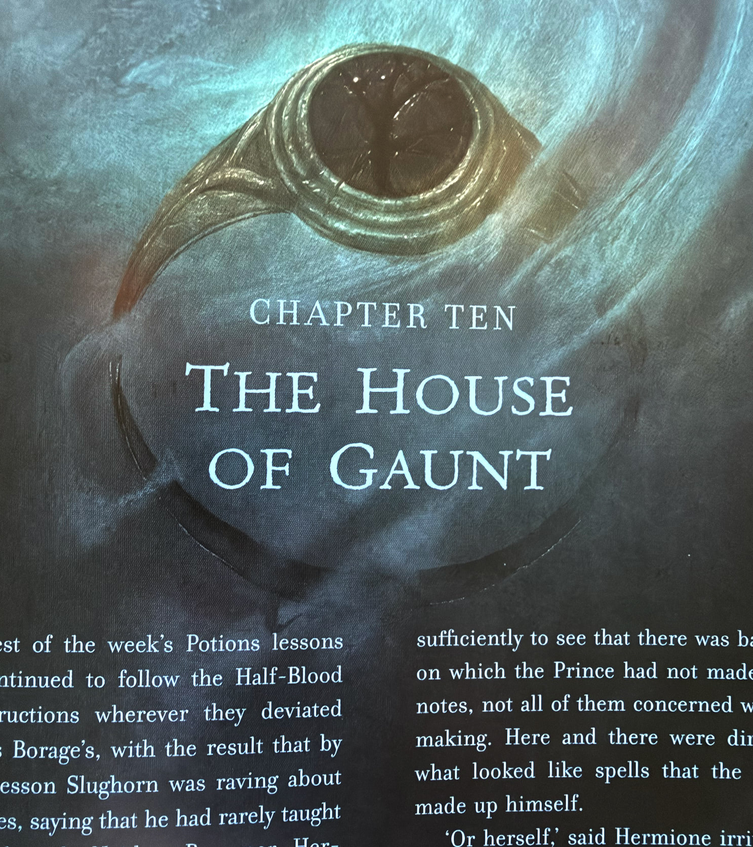
Half-Blood Prince is also unique in that it has a number of key scenes which never made it into the 2009 Warner Bros. film adaptation, a film that took a Gryffindor-sized sword to Rowling’s narrative. It sounds like a pejorative to say those scenes remained ‘unsullied’, but there is something incredibly refreshing about seeing Pinfold’s interpretation of scenes we’ve never seen on the silver screen (the cold open with the Muggle Prime Minister, anyone). Pinfold acknowledges this too, noting that Dumbledore’s Pensieve memory scenes were some of his favourites to illustrate (calling them gothic and Dickensian and a ‘book within a book’), and using a monochromatic palette of dark blue-grey tones, something he intentionally contrasted with ‘real life’ sequences such as Dumbledore’s funeral, which is set in striking sunlight.
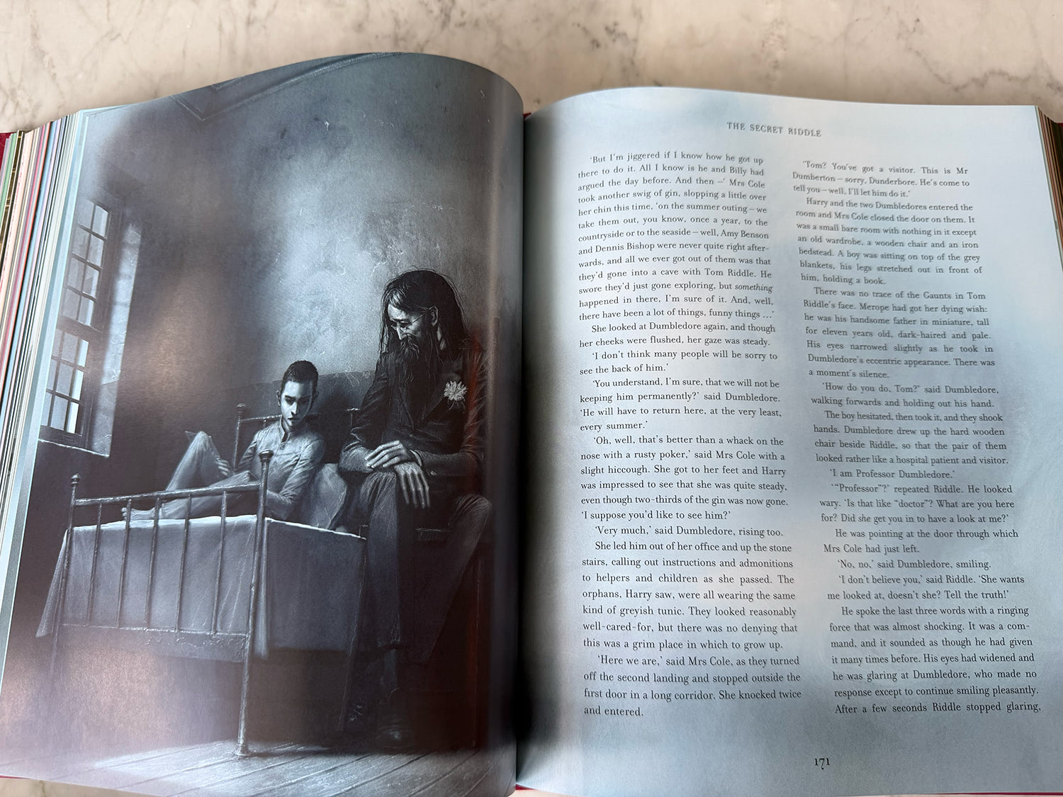
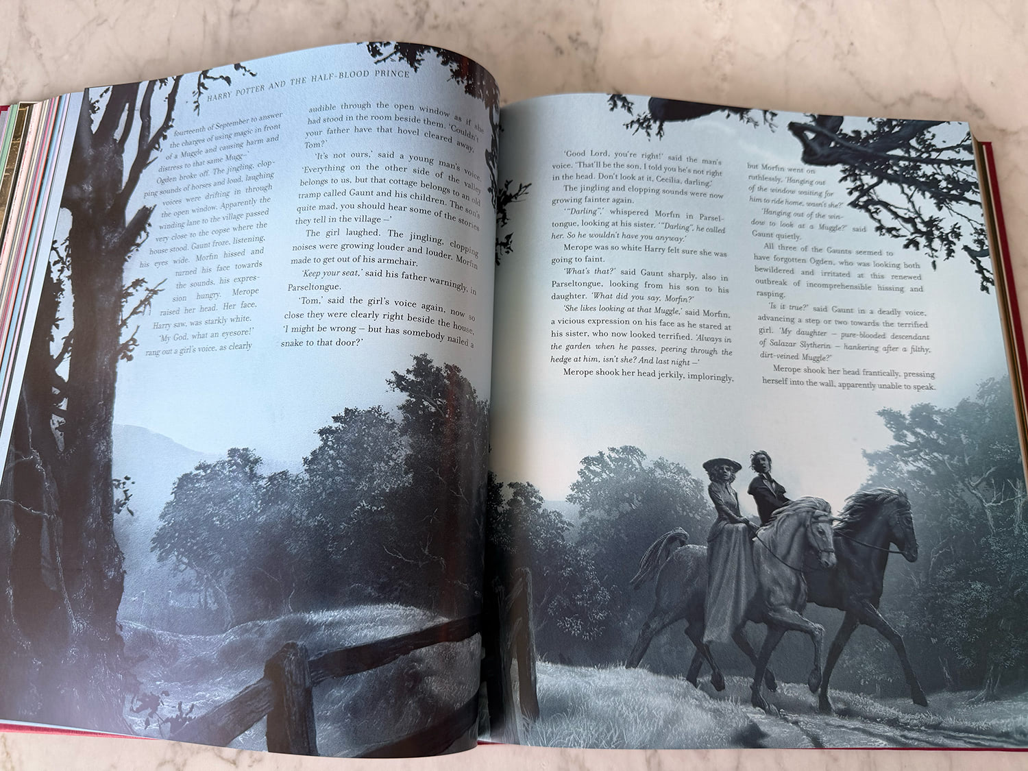
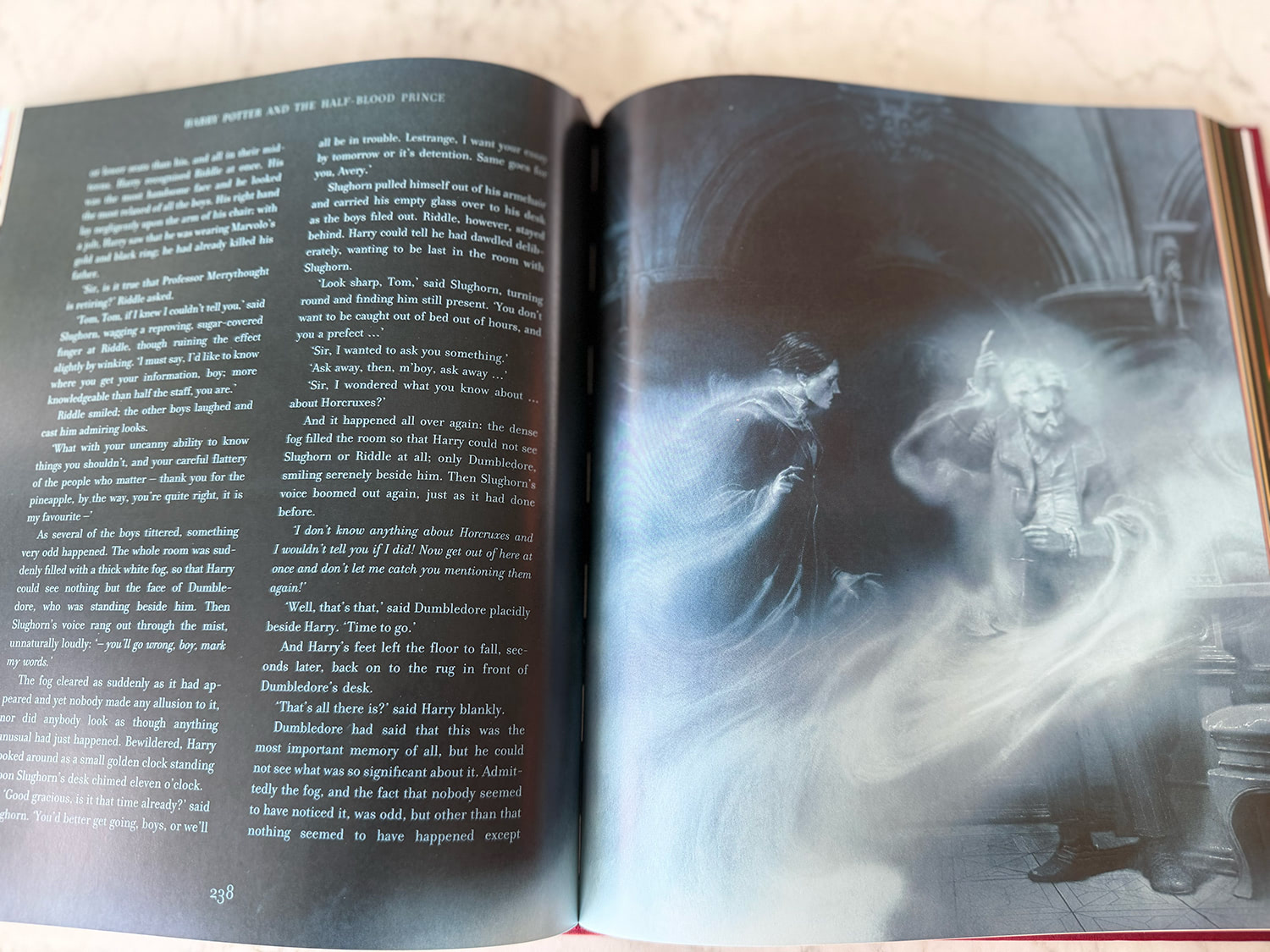
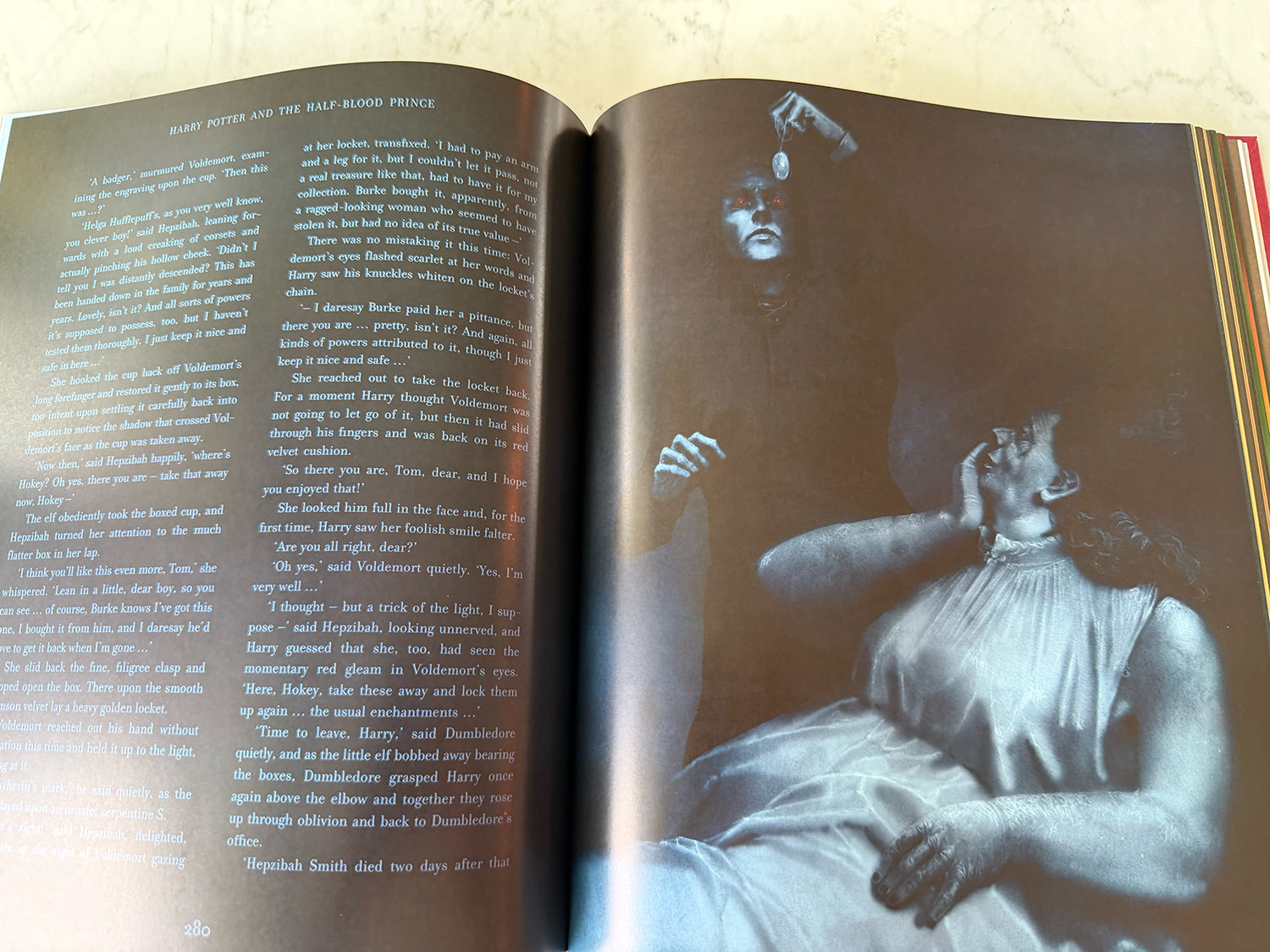
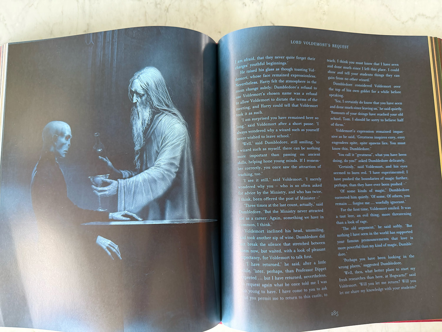
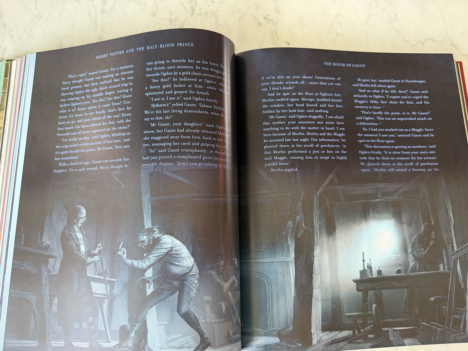
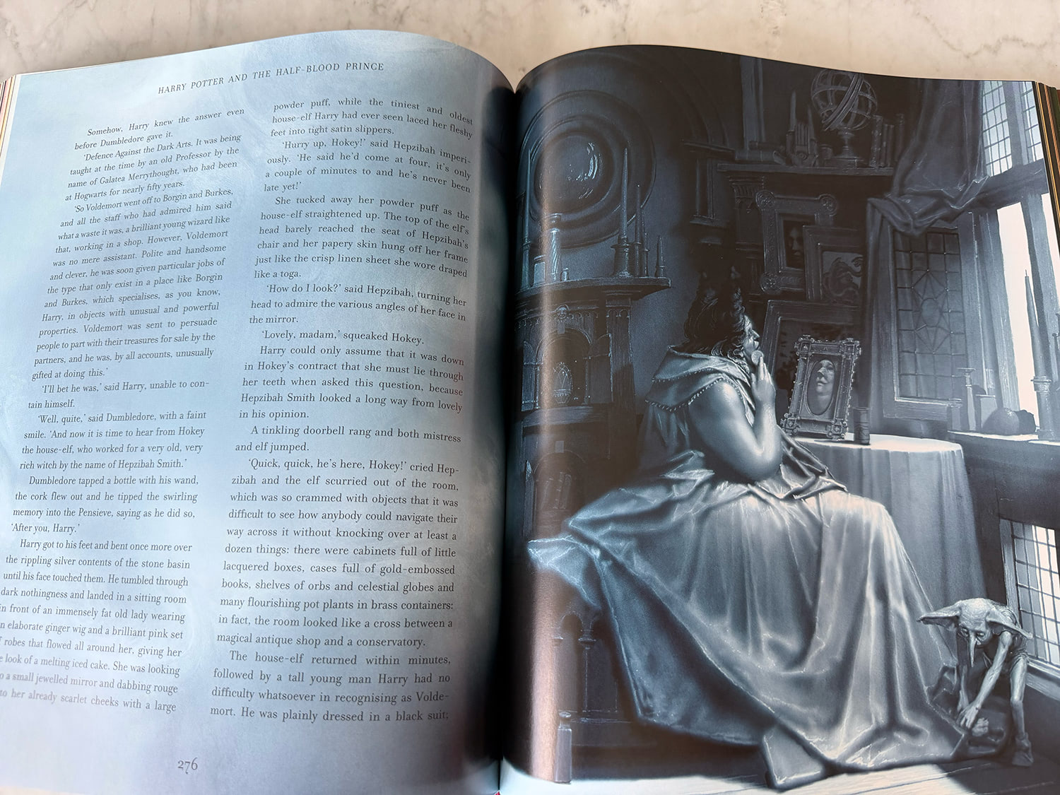
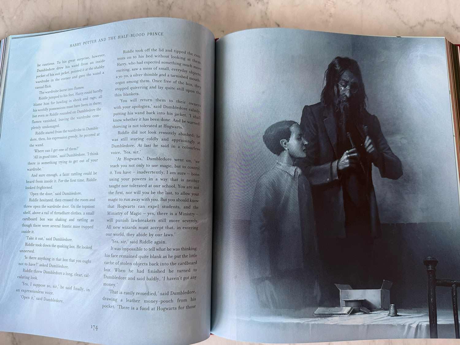
Pinfold’s affinity for these memory scenes is evident in the number of illustrations he weaves into the text. The Gaunt house flashback, Tom Riddle orphanage scene and Hepzibah Smith memory all get at least three illustrations (some in as many pages), and Lord Voldemort’s return to Hogwarts to attempt to secure the Dark Arts job has a striking portrait of a waxy and warped Voldemort, a scene I’ve had in my head for the best part of two decades. Interestingly, the few memory sequences which are included in the Half-Blood Prince film are heavily graded in greens, and there are some strong parallels in Pinfold’s paintings, swapping greens for blue and grey.
‘People are reading along with the text, and you’ve got no wiggle room’
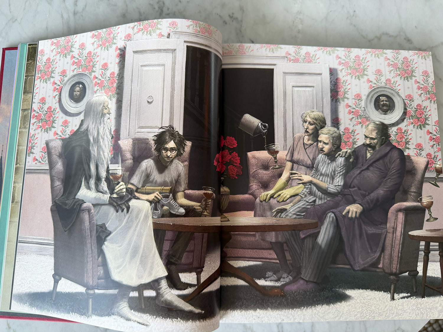
Like Kay before him, Pinfold’s interpretations feel like his own — he made a conscious effort to avoid parroting the portrayals we’re so used to seeing in the Warner Bros. film series (we finally see a bald-and-book-accurate Slughorn, for example), using Rowling’s words (‘you’ve got no wiggle room’) to inform his compositions, right down to the direction characters are described as standing. Pinfold’s illustrations are fittingly personal too, loaded with easter eggs and nods to family and friends (‘I hope you can see yourself in every mark, line and colour’). Two of the house-elves are based on his daughters, the Dursley home is based on houses Pinfold visited in the 1990s and Spinner’s End is inspired by a mill near his father’s engineering firm. Rowling gave her blessing to Pinfold’s work, but was largely ‘hands off’ during the process (in fairness, this is largely how Rowling’s ‘stamp of approval’ approach to new content operates in the 2020s ‘Potter’ world landscape).
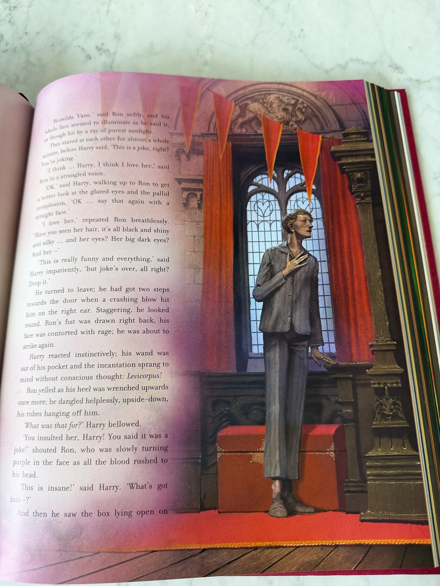
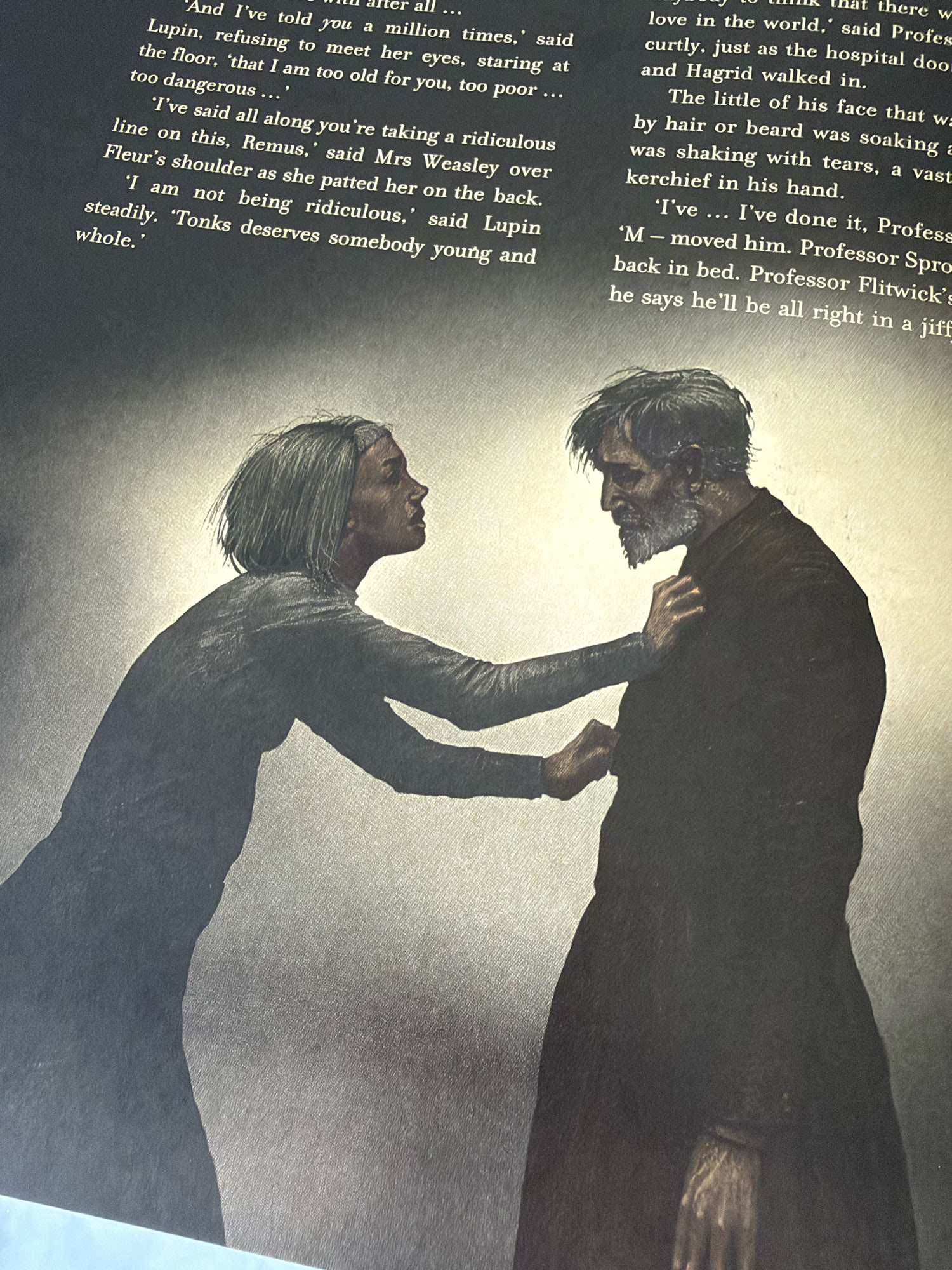
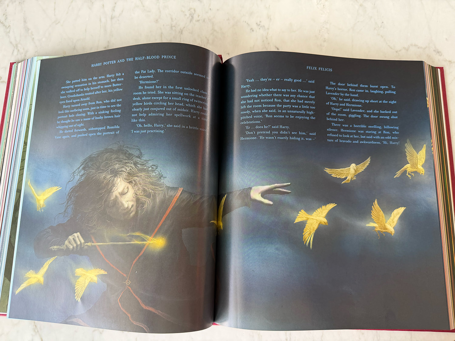
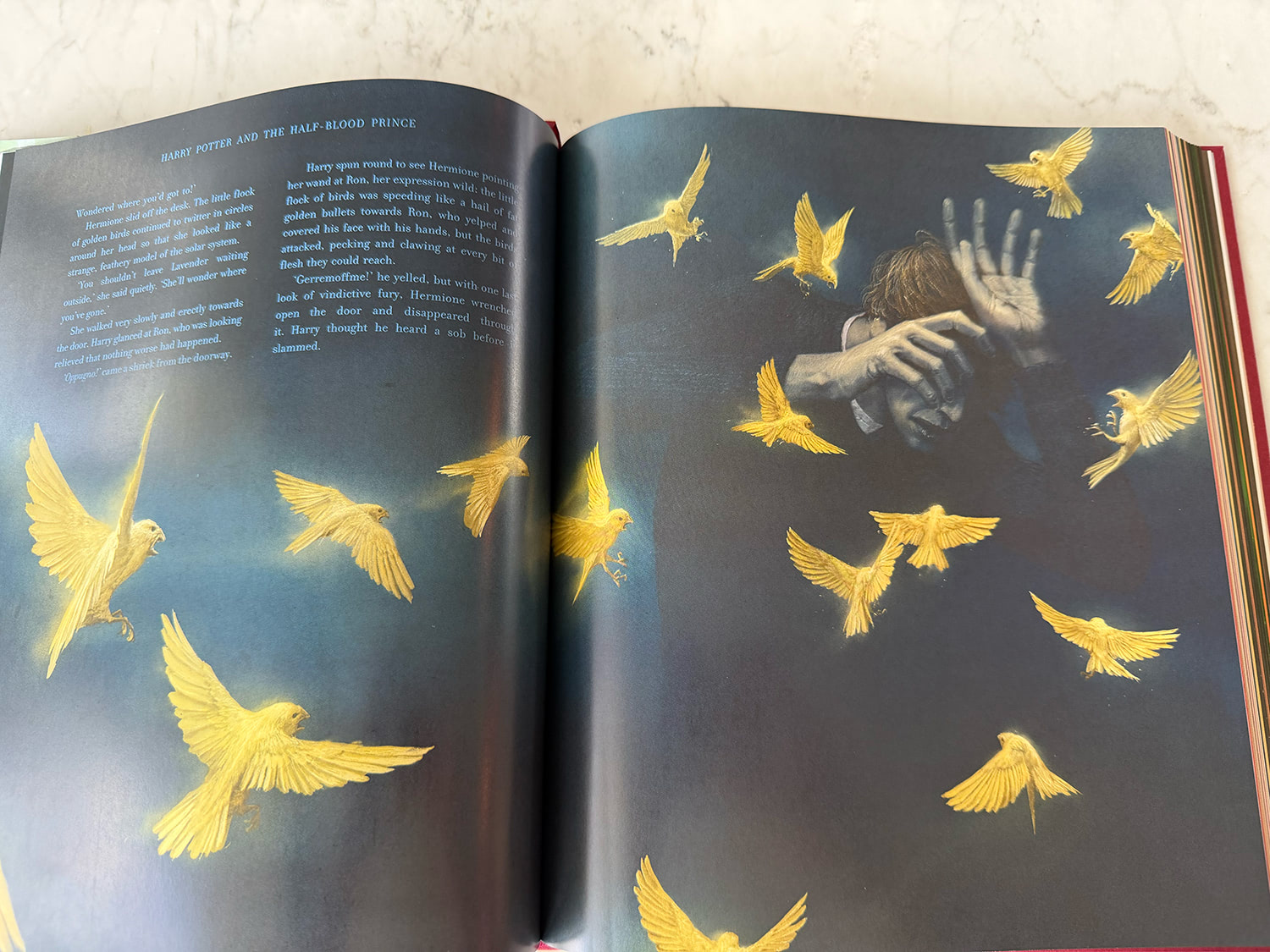
So how does Half-Blood Prince stack up against its five hefty predecessors? It certainly feels like the most cohesive volume, due in significant part to the sheer amount of artwork Pinfold has contributed (the endeavour took him roughly 18 months and on a good week he’d produce three illustrations), but also the lovely evolving background colourways splashed throughout the chapters. The lack of artwork for key scenes was a major criticism of the last two releases, but it’s worth pointing out those two novels are gargantuan (Neil Packer noting in an interview that including more artwork would have caused binding issues, hence random artistic embellishments in margins rather than more art-pages), and Kay has been criticised by some readers for his focus on drawing cats, dogs, dragons and an assortment of creepy crawlies, rather than some of the key human characters and scenes. It’s also worth mentioning that Pinfold utilises digital illustration techniques, while Kay mixed sketches, painting and other textures in his editions, an approach some have criticised as feeling less harmonious.
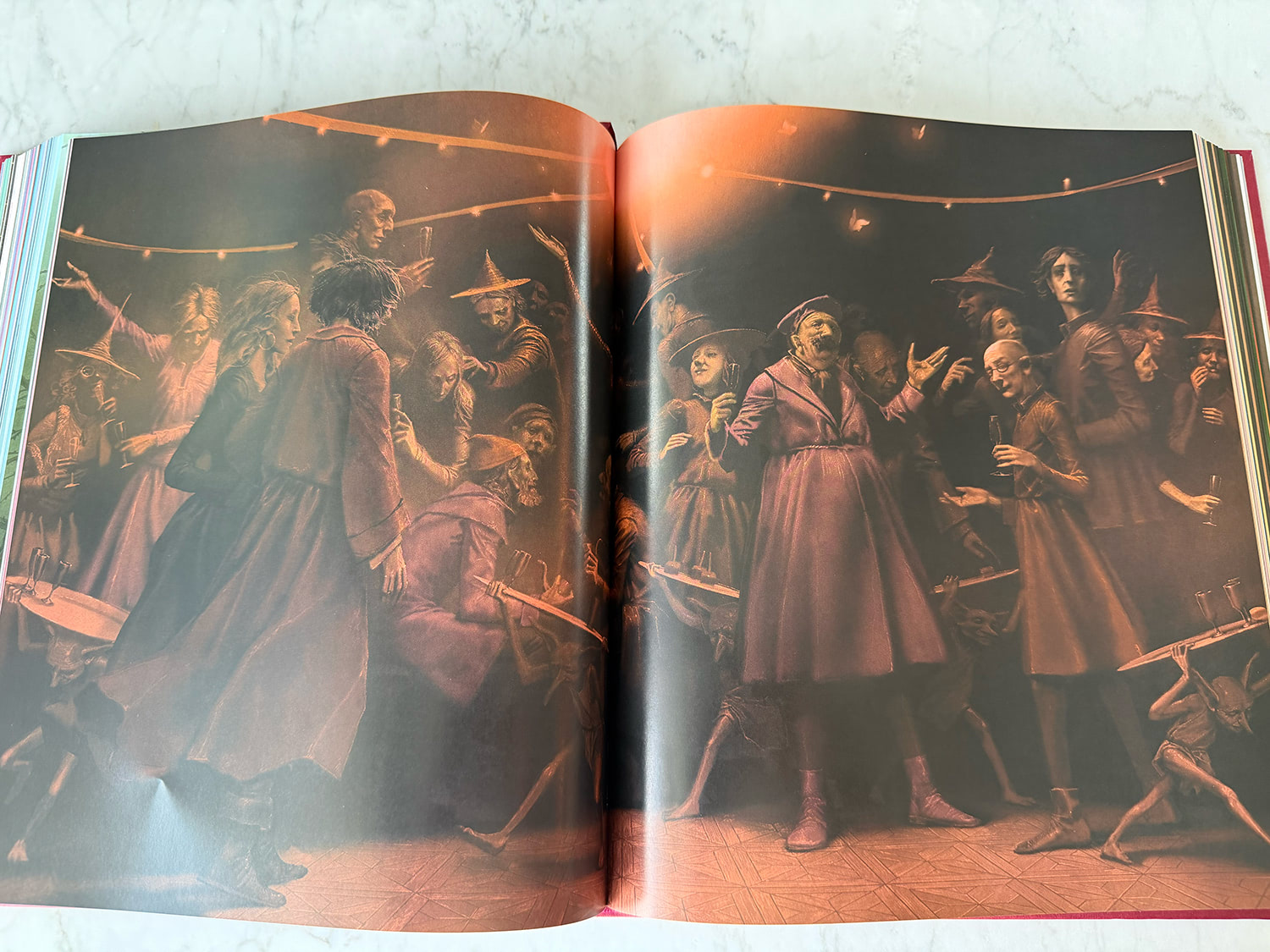
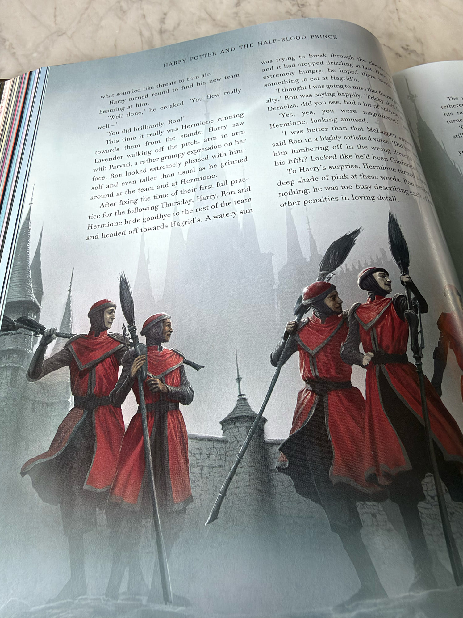
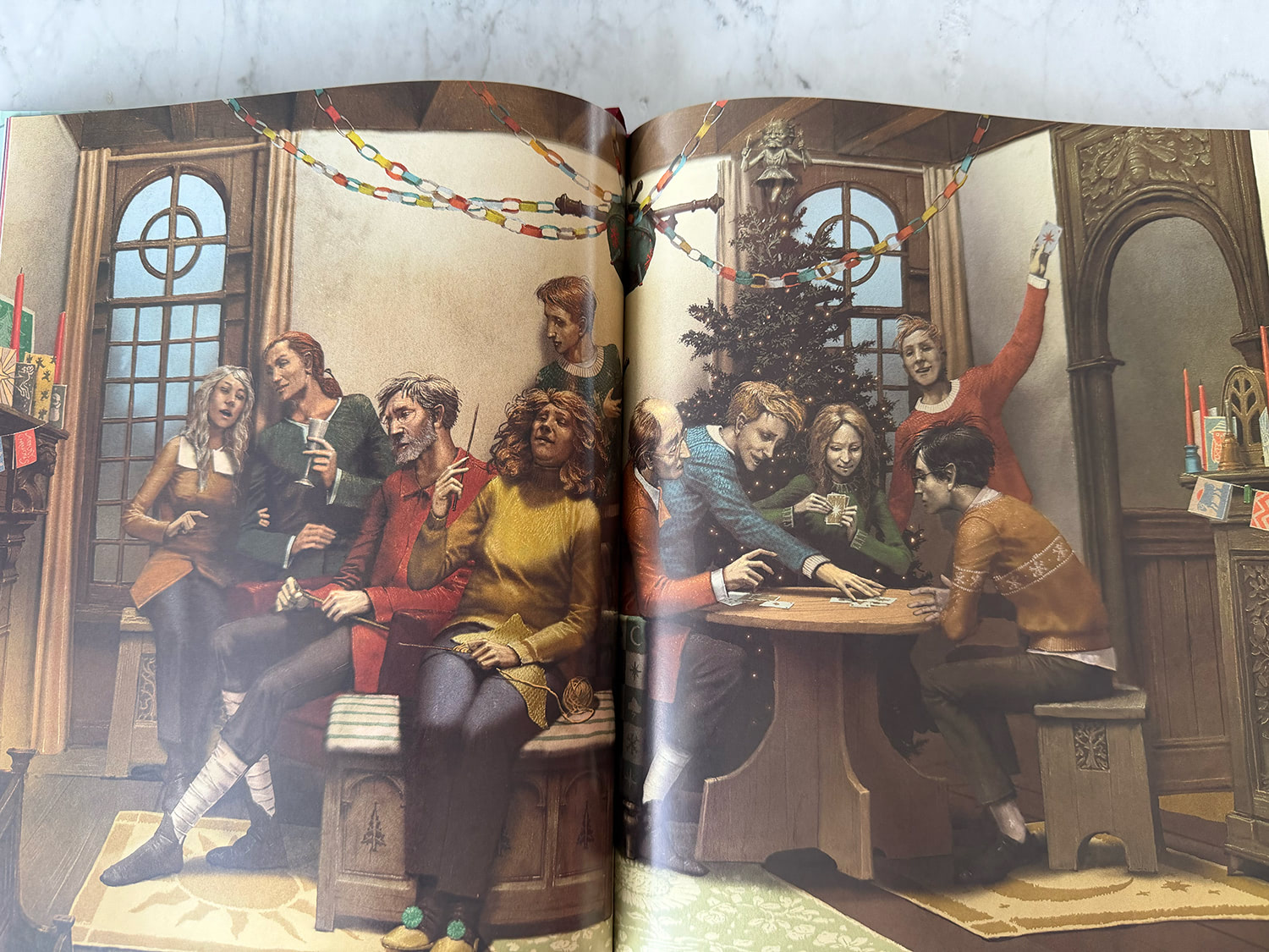
Pinfold’s style is likely going to be the most divisive aspect of this release — it’s either your cup of pumpkin juice or it isn’t. His incredibly stylised approach to characters is particularly striking in human and indoor scenes. Characters are long-limbed, spindly, sometimes appearing hollow and sallow-skinned. It almost feels like we’re in a horror story. While this illustrative approach works really well in atmospheric outdoor compositions (Hogwarts’ intricate spindly towers and turrets are an amazing sight to behold), it does lack a whimsical magical warmth in scenes that aren’t inherently dark. This is particularly evident in large spreads depicting Dumbledore’s visit to the Dursleys, Fred and George’s joke shop, the Gryffindor Quidditch team, Slughorn’s Christmas party and the Weasley Christmas. Likewise, Pinfold draws a number of characters with glasses which obscure their eyes; it’s wonderfully theatrical but does feel quite cold.
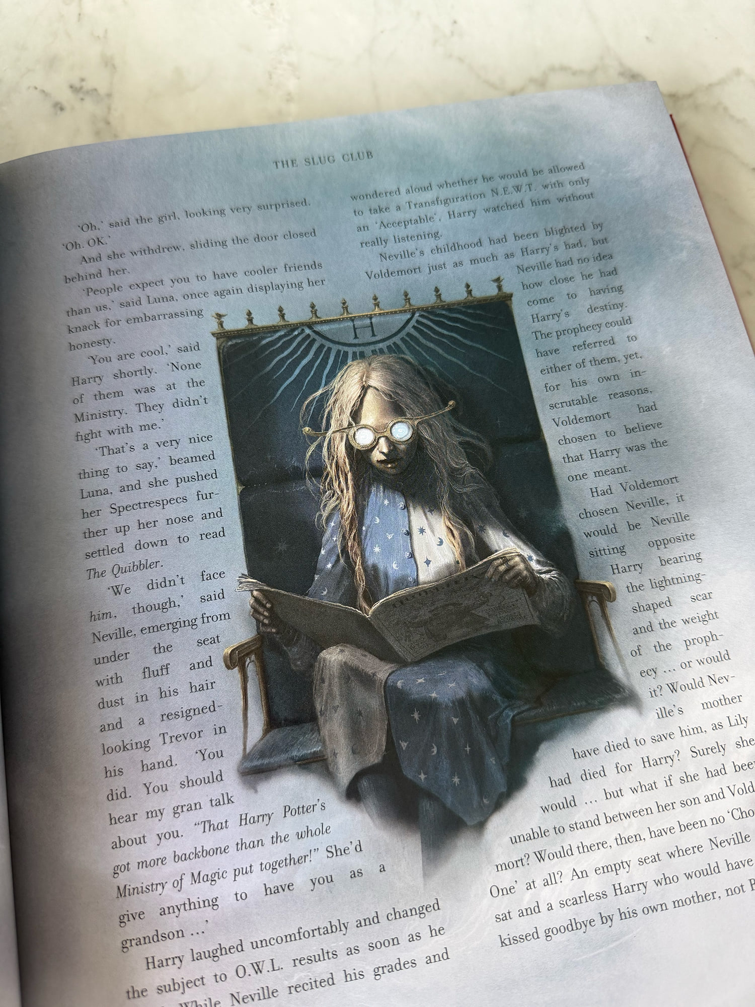
‘When things take a darker or unsettling turn, I feel completely at home’
There is an argument that Half-Blood Prince marks a significant tonal shift in the ‘Potter’ books and that an artistic evolution is poignant and appropriate, if not necessary for these books. If Pinfold had been tasked with originating the illustrated editions I’m not sure the warmth and magic of the Wizarding World would be appropriately captured. You might be forgiven for thinking this is ‘Potter’ through a Tim Burton-esque lens, rather than a warm hug ‘read-your-child-the-magic-of-Harry-Potter-before-bed’ tome, as some illustrated companion books are marketed (and which seems like Bloomsbury’s initial pitch all those years ago). As an adult reader, however, (and someone who grew up with the series), this feels like a novel way to bring Half-Blood Prince’s unique approach to magical storytelling to the fore.
Pinfold will also illustrate the final ‘Potter’ book, Deathly Hallows, and in September he was busy drawing Xenophilius Lovegood at Bill and Fleur’s wedding. It’s a fitting assignment given Rowling has repeatedly described the final two instalments as ‘two halves of the same novel’. The final two volumes deserve a cohesive conclusion, and Pinfold is certainly capable. It’ll be nice to see that style carried through into some of Deathly Hallows’ more striking chapters — the Three Brothers sequence is just yearning for a haunting Pinfold interpretation, and I can already picture Harry and Dumbledore at King’s Cross with suitably monochromatic fog and atmosphere. It’s fitting that Half-Blood Prince opens with Minister for Magic Cornelius Fudge introducing his successor: earlier this month, Kay gave Pinfold’s illustrated edition a glowing review, and Pinfold recognises Kay’s kindness and warmth on his acknowledgements page. In Harry Potter lore, the wand chooses the wizard. It seems fair to say the paintbrush has passed into suitably magical hands.
***
The Half-Blood Prince illustrated edition is now available and can be purchased on Amazon (US, UK) and Bookshop.org. A deluxe edition will be available in November. You can view more of Levi’s artwork in our illustrated editions section.
My review includes quotes from Pinfold from a September 2026 profile in The Australian, as well as interviews with his agency Arena Illustration and the release announcement on HarryPotter.com.