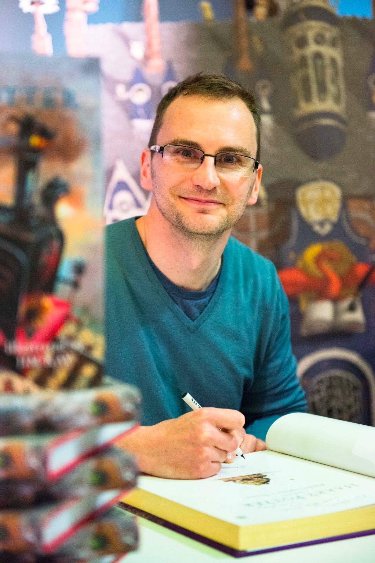
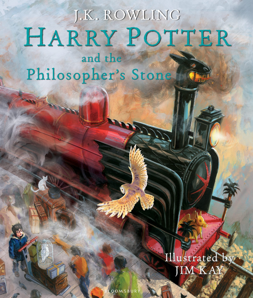
Harry Potter Fan Zone recently had the chance to participate in a group interview with Jim Kay, the artist behind the gorgeous Harry Potter and the Philosopher’s Stone illustrated edition, released today. Jim is currently at work illustrating Harry Potter and the Chamber of Secrets, but took some time out to talk about bringing J.K. Rowling’s words to life.
Were you influenced by previous Harry Potter illustrators/the films or did you veer away from both?
Jim Kay (JK): I’m a huge fan of both the books and the films. I thought the screen adaptations were a wonderful showcase of the best set design, product design, costume, casting, directing and acting their disciplines had to offer. I knew from the start that I’m competing to some degree with the hundreds of people involved in the visuals of the film. I remember watching the extras that come with the movie DVDs a few years back, and wondering how on earth you’d get to be lucky enough to work on the visuals for such a great project. To be offered the opportunity to design the whole world again from scratch was fantastic, but very daunting. I’d like to think that over the years lots of illustrators will have a crack at Potter, in the same way that Alice in Wonderland has seen generations of artists offer their own take on Lewis Carroll’s novel. I had to make it my version though, and so from the start I needed to set it apart from the films. I’ll be honest I’ve only seen a few illustrations from other Potter books, so that’s not been so much of a problem. I love Jonny Duddle’s covers, and everyone should see Andrew Davidson’s engravings — they are incredible!
What was the most important detail for you to get right with your illustrations?
JK: To try and stay faithful to the book. It’s very easy when you are scribbling away to start wandering off in different directions, so you must remind yourself to keep reading Jo’s text. Technically speaking though, I think composition is important — the way the movement and characters arrange themselves on the page — this dictates the feel of the book.
What medium do you use to create your illustrations?
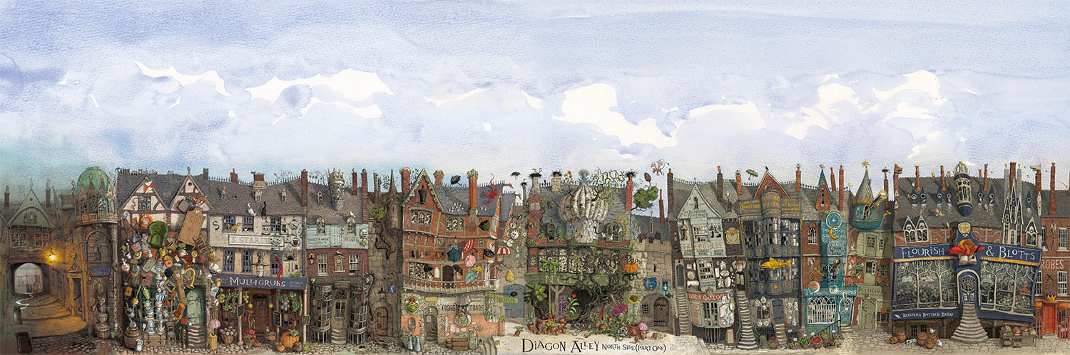
JK: I use anything that makes a mark — I am not fussy. So I don’t rely on expensive watercolour or paints, although I do occasionally use them – I like to mix them up with cheap house paint, or wax crayons. Sometimes in a local DIY store I’ll see those small tester pots of wall paint going cheap in a clear-out sale, and I’ll buy stacks of them, and experiment with painting in layers and sanding the paint back to get nice textures. The line is almost always pencil, 4B or darker, but the colour can be a mixture of any old paint, watercolour, acrylic, and oil. Diagon Alley was unusual in that I digitally coloured the whole illustration in order to preserve the pencil line drawing. I’d recommend experimenting; there is no right or wrong way to make an illustration, just do what works for you!
Because each book is so rich in detail, what is your personal process when choosing specific images?
JK: I read the book, then read it again and again, making notes. You start off with lots of little ideas, and draw a tiny thumbnail illustration, about the size of a postage stamp, to remind you of the idea for an illustration you had while reading the book. I then start to draw them a little bigger, about postcard size, and show them to Bloomsbury [UK publisher]. We then think about how many illustrations will appear in each chapter, and try to get the balance of the book right by moving pictures around, dropping or adding these rough drawings as we go. With Harry Potter and the Philosopher’s Stone Bloomsbury were great in that they let me try all sorts of things out, different styles, concepts. Some I didn’t think would get into the final book, but everyone was very open to new ideas. There was no definite plan with regards to how the book would look; we just experimented and let it evolve.
Given the distinct split of younger vs. more mature readers of the series, how do you construct your illustrations so that they can appeal to both audiences at once?
JK: The simple answer is I don’t try. I think only about the author and myself. You can’t please everyone, particularly when you know how many people have read the book. I don’t think good books are made by trying to appeal to a wide audience. You just try to do the best work you can in the time given, and respect the author’s work. Most illustrators are never happy with their own work. You always feel you want to try more combinations or alternative compositions. You are forever in search of that golden illustration that just ‘works’, but of course it’s impossible to achieve — there will always be another way of representing the text. Effectively you chase rainbows until you run out of time! You get a gut feeling if an image is working. I remember what I liked as a child (Richard Scarry books!). Detail and humour grabbed me as a nipper, and it’s the same now I’m in my forties.
Did you base any characters or items in the book on real people or things?
JK: Lots of the book is based on real places, people and experiences. It helps to make the book personal to me, and therefore important. The main characters of the books are based on real people, partly for practical reasons, because I need to see how the pupils age over seven years. In Diagon Alley in particular, some of the shop names are personal to me. As a child we had a toad in the garden called Bufo (from the latin Bufo bufo), Noltie’s Botanical Novelties is named after a very clever friend of mine who works at the Royal Botanic Gardens, Edinburgh. The shop called ‘Tut’s Nuts’ is a little joke from my days working at Kew Gardens; they had in their collections some seeds from the tomb of Tutankhamun, which were affectionately known as ‘Tut’s Nuts’. The imprisoned boy reaching for an apple in Brigg’s Brooms is from a drawing my friend did when we were about 9 years old — that’s thirty two years ago!
Which character was the most difficult to draw?
JK: Harry, without a doubt. Children are difficult to draw because you can’t use too many lines around the eyes and face, otherwise they look old. One misplaced pencil line can age a child by years, so you have to get it just right. Also Harry’s glasses are supposed to look repaired and bent out of shape, which I’ve found tricky to get right.
What is your favourite scene you have illustrated?
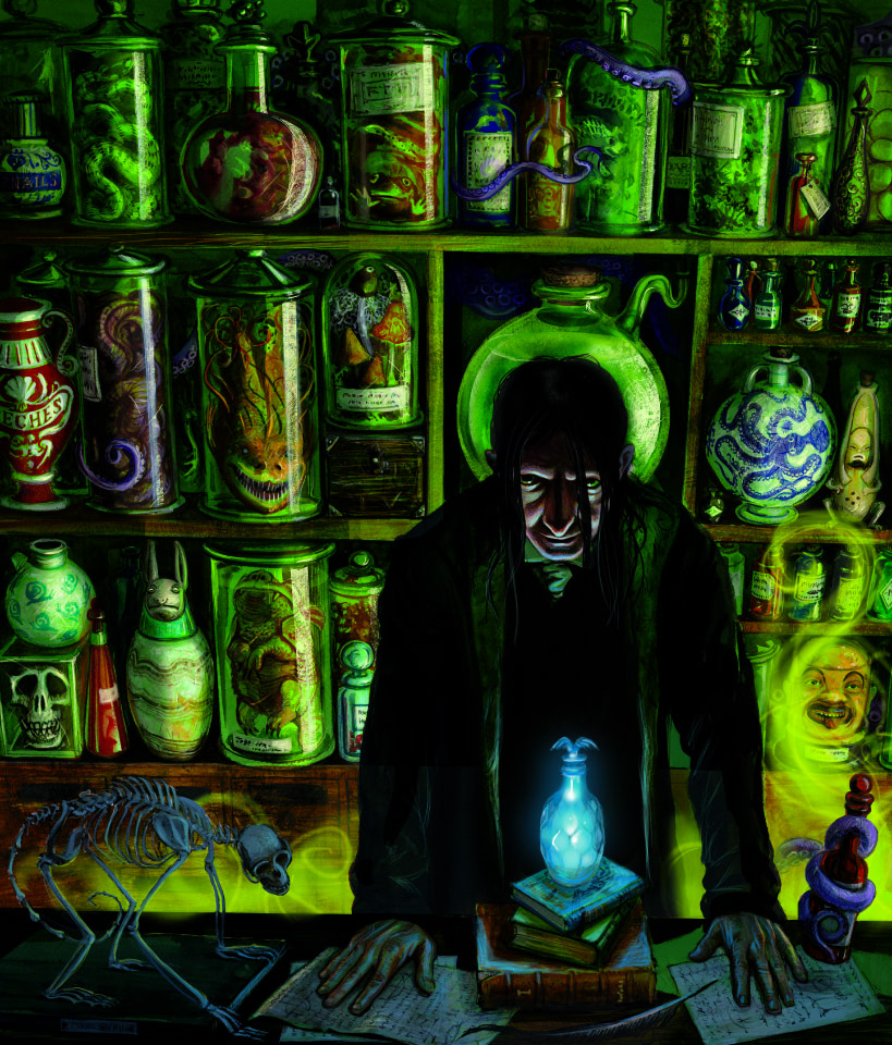
JK: That’s a difficult one. I’m fond of the ghosts. I paint them in reverse (almost like a photographic negative) and layer several paintings to make them translucent. I enjoyed Nearly Headless Nick. I really enjoyed illustrating the trolls too. Your favourite illustrations tend to be the ones that gave you the least amount of difficulties and I think Diagon Alley was nice for this reason. It was more like a brainstorming exercise, slowly working from left to right. My favourite character to illustrate is Hagrid — I love big things!
Are there any hidden messages/items in your drawings for the Harry Potter series?
JK: There are, but they are little things that relate to my life, so I’m not sure how much sense they’d make to other people. I like to include my dog in illustrations if I can (he’s in Diagon Alley). I also put a hare in my work, for good luck. There’s a hare in A Monster Calls, and in Harry Potter. My friends appear as models for the characters in book one, and some of their names too can be seen carved on a door, and on Diagon Alley. There are little references to later books too, such as on the wrought-iron sign of the Leaky Cauldron. I do it to keep things interesting for me while I’m drawing.
Harry Potter Fan Zone (HPFZ): How did you approach illustrating the Hogwarts Castle and grounds?
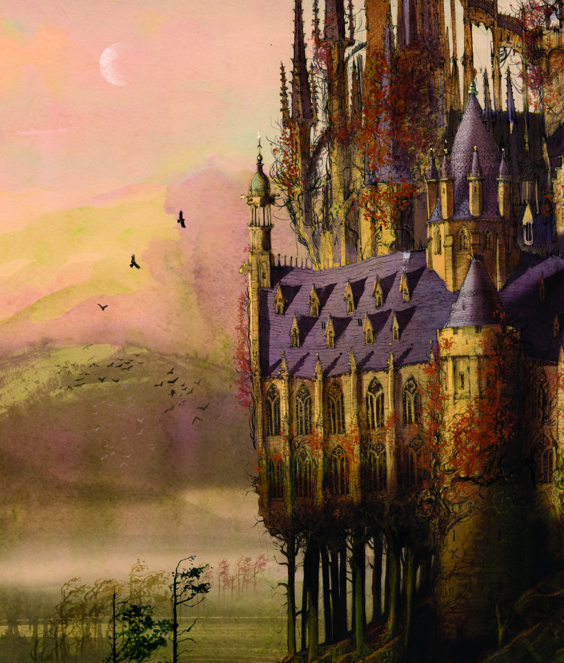
JK: I really enjoyed doing this. You have to go through all seven books looking for mentions of the individual rooms, turrets, doors and walls of the castle, and make lots of notes. Then you check for mentions of its position, for example if you can see the sun set from a certain window, to find out which way the castle is facing. I then built a small model out of scrap card and Plasticine and tried lighting it from different directions. It was important to see how it would look in full light, or as a silhouette. Then it was a long process of designing the Great Hall, and individual towers. I have a huge number of drawings just experimenting with different doorways, roofs. Some early compositions were quite radical, then I hit upon the idea of trees growing under, through and over the whole castle, as if the castle had grown out of the landscape. This also gives me the opportunity to show trees growing through the inside of some rooms in future illustrations.
What illustrations in the book are you most proud of?
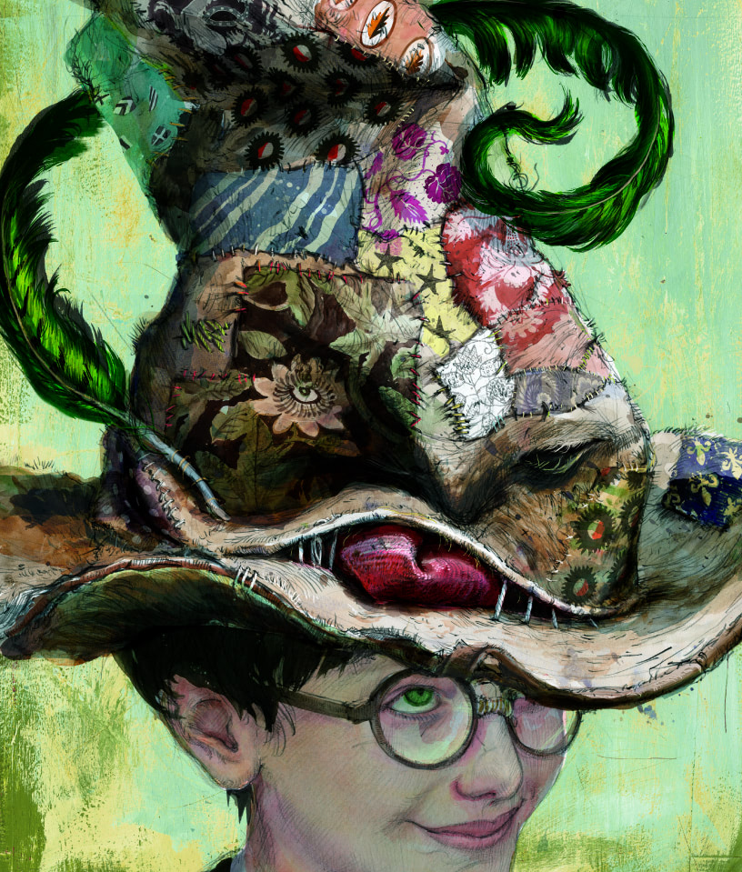
JK: Usually it’s the ones that took the least amount of effort! It takes me so many attempts to get an illustration to work, that if one works on the second or third attempt, it’s a big relief. There is one illustration in the book that worked first time (a chapter opener of Hogwarts architecture, with birds nesting on the chimney pots). It kind of felt wrong that the illustration was done without agonising over it for days, it didn’t feel real somehow, so I’m proud of that one because it’s so rare that I get an image to work first time! The only other illustration that was relatively straightforward was the Sorting Hat. Illustrations that come a little easier tend to have a freshness about them, and I think those two feel a little bit looser than others in the book.
Which book do you think will be the most challenging one to illustrate?
JK: At the minute it’s book two! I think book one I was full of adrenaline, driven by sheer terror! Book two I want to have a different feel, and that makes it challenging to start again and rethink the process.
HPFZ: Is there a particular scene in the future Harry Potter books you’re excited to illustrate?
JK: I’m really looking forward to painting Aragog in book two. I’m really fond of spiders — there are lots in my studio — so it’s great having reference close to hand! I’m hoping that by the Deathly Hallows we will be fully into a darker and more adult style of illustration, to reflect the perils facing Potter!
How many illustrations did you initially do for the book, and how many of those appeared in the final edition?
JK: There are stacks of concept drawings that no one will ever see, such as the Hogwarts sketches, which I needed to do in order to get my head around the book. Then there are rough drawings, then rough drawings that are worked up a little more, and then it might take five or six attempts for each illustration to get it right.
What house do you think you may have been placed in, aged 11, and would it be the same now?
JK: I’d like to think it was Ravenclaw as a child. I was much more confident back then, and creative, plus they have an interesting house ghost in the form of the Grey Lady. These days I work hard and am loyal, so probably Hufflepuff.
Illustrating aside, what is one thing that you love doing to express your creativity?
JK: It’s difficult to say because for the past 5 years I have worked on illustration seven days a week, every hour of the day. A few years back I started to write, and I really enjoyed that, it’s far more intimate than illustrating, and I love going over the same line and trying to hone it down to the core of what you are trying to express. My partner makes hats, and I’m very envious. It looks like wonderful fun. We have lots of designs for hats in sketchbooks. I really want to get some time to make some. I’ve always been slightly torn that I didn’t go into fashion, but my sewing is terrible. I used to play guitar a lot and write little bits of music, but that’s difficult now because my hand gets very stiff from drawing all day! The funny thing is, if I did ever get a day off, I’d just want to draw!
Thanks, Jim!
***
The Harry Potter and the Philosopher’s/Sorcerer’s Stone illustrated edition is in stores from today. You can explore more artwork from the book by clicking here.