This article is part two in our exclusive profile of graphic designers MinaLima, the artists responsible for all the graphic design in the Harry Potter universe.
***
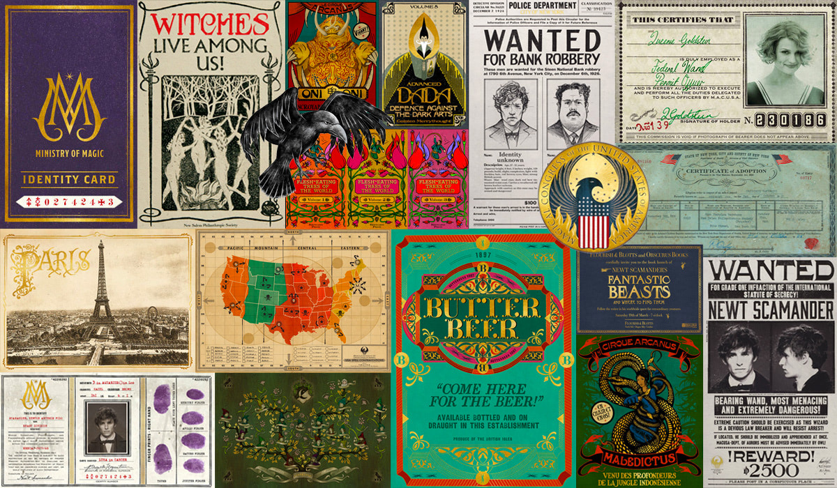
One of Harry Potter’s first magical possessions is a book by the name of Fantastic Beasts and Where to Find Them, a colourful guide to the menagerie of magical creatures in J.K. Rowling’s Wizarding World. It was the job of graphic artist Miraphora Mina to give that textbook visual form in the 2001 film adaptation of Harry Potter and the Philosopher’s Stone. Fantastic Beasts was an incidental graphic prop — one of many meticulously designed magical tomes to accompany Harry’s schooling adventures. Mira had no idea that fifteen years later that prop would be her gateway to a new and uniquely challenging Harry Potter experience.
In late 2013, two years after Harry’s final adventure hit the silver screen, Warner Bros. announced their intention to expand the Wizarding World with a new series of spinoff-turned-prequel stories. The Fantastic Beasts films would complete the hitherto unknown backstory of a new fictional hero, Newt Scamander, a ‘magizoologist’ and author of Fantastic Beasts and Where to Find Them. Set seventy years before Harry’s tale, the slated five-film franchise follows Newt’s adventures, interwoven with those of a young Hogwarts professor (later headmaster) Albus Dumbledore and his complex relationship with dark wizard and proto-Voldemort figure Gellert Grindelwald.
Behind the camera, a talented group of Harry Potter alumni would join forces once more. David Yates, the director who helmed the last four ‘Potter’ films, would return to shoot the prequel series. Both producer David Heyman and production designer Stuart Craig — names credited alongside all eight ‘Potter’ films — returned to manage and expand the design of the Wizarding World, and J.K. Rowling shifted from a producer and overseer-of-story role to take on the challenges of solo screenwriter. In the art department, graphic design extraordinaires MinaLima (a pairing of artists Miraphora Mina and Eduardo Lima) are back to shape and colour a new universe of magical props and locations, this time spread across continents, time periods, and, perhaps most interestingly, the Muggle (‘non-magic’) world.
‘We used to joke if anything in the script said “Muggle” … it’s so boring, isn’t it?’
For Miraphora and Eduardo, the Fantastic Beasts films present a number of unique graphic design opportunities that are quite distinct from their ‘Potter’ predecessors. In the Harry Potter universe the design duo had the opportunity to create a graphical palette largely disconnected from any established era. Not only are the Fantastic Beasts films set in a real-world time period, they also largely take place in a Muggle setting. And while forays into a present-day Muggle environment might have been largely mundane in the ‘Potter’ films (‘we used to joke if anything in the script said “Muggle” … it’s so boring, isn’t it?’), it is far from monotonous in these rich historical settings. ‘Every single time you step outside of the door you’re trying to recreate posters, advertising, shop fronts, typography … and so much of it was hand-painted,’ explains Mira excitedly. ‘That was a massive gift to a designer.’
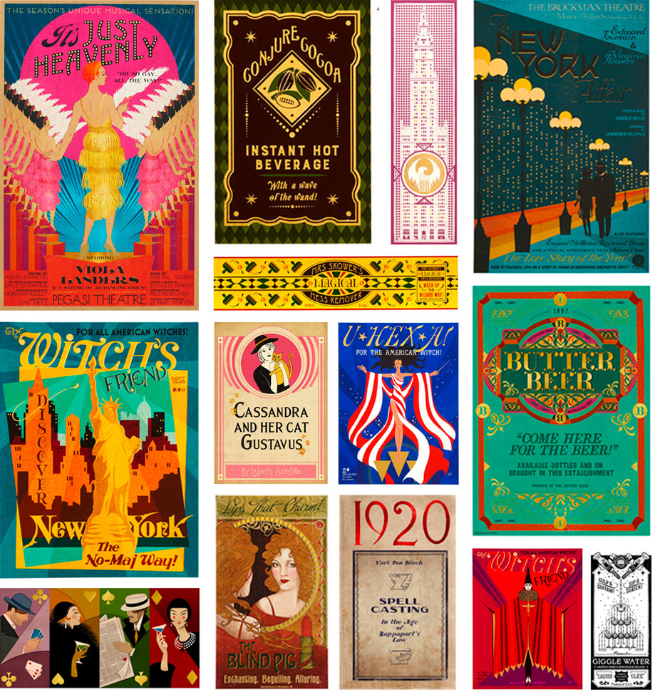
At the time of our chat, the duo have two Fantastic Beasts films under their belt. A third is in the early stages of pre-production. The franchise’s debut entry, the titular Fantastic Beasts and Where to Find Them (2016), takes place in New York City in the roaring twenties. The story begins in a Muggle-only setting and, as the plot unfolds, introduces audiences to the Wizarding World of North America. The film’s first sequel, Crimes of Grindelwald (2018), sees our protagonists travel a similar path in late-twenties Paris. MinaLima embraced the opportunity to sprinkle a unique brand of magical graphical design atop two iconic cultural backdrops. ‘It presented a different set of challenges and probably required more work,’ says Mira. ‘But it was a gift and we loved it for different reasons.’
And while much of the action does take place in the Muggle world, one of the most exciting concepts explored to date in the ‘Beasts’ films is the geographical expansion of Rowling’s magical world — the communities, government institutions and magical schools of witches and wizards abroad. MinaLima’s approach to establishing a graphical style and identity for these parallel (and equally clandestine) magical worlds was ‘slightly different because they are already set in a specific period’. Recounts Mira, ‘it was difficult perhaps to make the jump from the Muggle to the Wizarding World a little bit more when you’re in the historical setting.’
‘We start with that reality and then transpose that into our world’
In Fantastic Beasts, Newt’s animal antics see him called before MACUSA, the Magical Congress of the United States of America and American equivalent of Britain’s Ministry of Magic. Concealed by enchantments inside New York’s Woolworth Building, it was MinaLima’s job to give the organisation a logo and suitably magical identity. On film, that branding is visible across leaflets, maps and other pieces of official magical documentation. ‘We asked ourselves, “how visually does America show itself in an organisation?”,’ recalls Mira. ‘We looked at lots of government and ministry seals, even the seal of the country is very traditional — and kind of boring actually.’
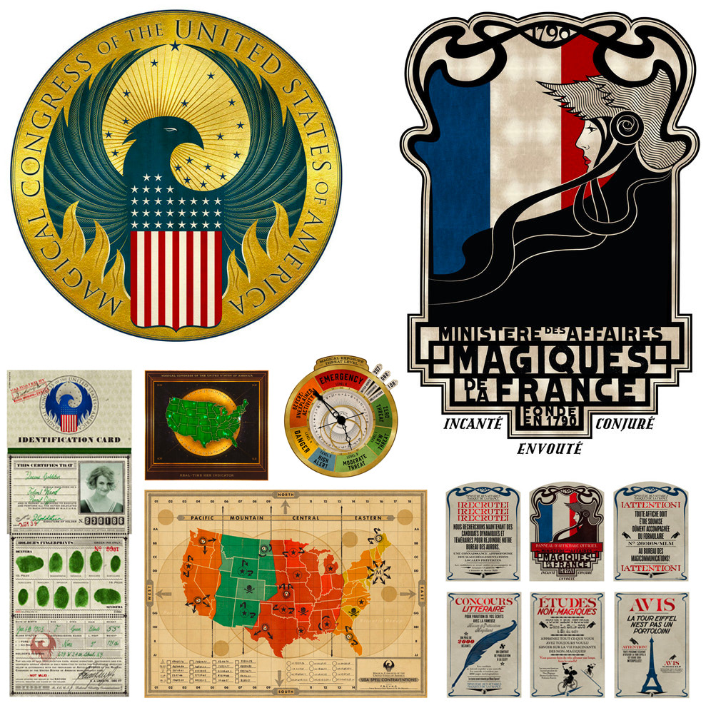
Like many of their magical motifs, the duo riffed on a parallel Muggle concept and twisted and skewed the design for added Wizarding flavour. Miraphora took the iconic American flag (‘making sure it had the forty-eight stars correct for the period’) and then ‘exploded’ the stars. Says Mira, ‘that’s kind of a nice motif anyway in the Wizarding World … we start with that reality and then transpose that into our world.’ The American Ministry represents itself with the mythical Phoenix, and the team incorporated a flaming songbird into the organisation’s logo. Explains Mira, ‘American [logos] usually have an animal of some description … it’s got some authority.’
In Crimes of Grindelwald our heroes find themselves exploring the charming cobblestone streets of Paris. As the plot unfolds, Rowling’s story sees Newt and co. visit the Ministry of Magic’s French counterpart, Le Ministère Des Affaires Magiques De La France. For reference, MinaLima looked at ‘state kind of representations in marks, in logos’ alongside illustrations of Marianne, the powerful French revolutionary figure. Production designer Stuart Craig had incorporated statues in the French ministry set, and MinaLima played on that motif in the organisation’s logo. Recounts Mira: ‘the revolution figure is very symbolic for the French people … we looked at the statues in the actual Ministry [and] referenced that in the logo.’
‘It still needed to be glitzy and kind of enchanting, but it had a dark side’
Much like the Harry Potter films, Miraphora and Eduardo have the exciting opportunity to contribute significant graphic design to grandiose set pieces. In Crimes of Grindelwald, a Wizarding ‘freak show’ arrives in Paris. The team designed a wealth of incredibly imaginative promotional paraphernalia for the Circus Arcanus sequence. In a relatively short (but complex) scene, MinaLima’s graphics serve as more than just visual decoration. Collectively, they help establish tone (‘it still needed to be glitzy and kind of enchanting, but it had a dark side’), provide additional context and exposition, and help progress the plot in a way that dialogue alone can not.
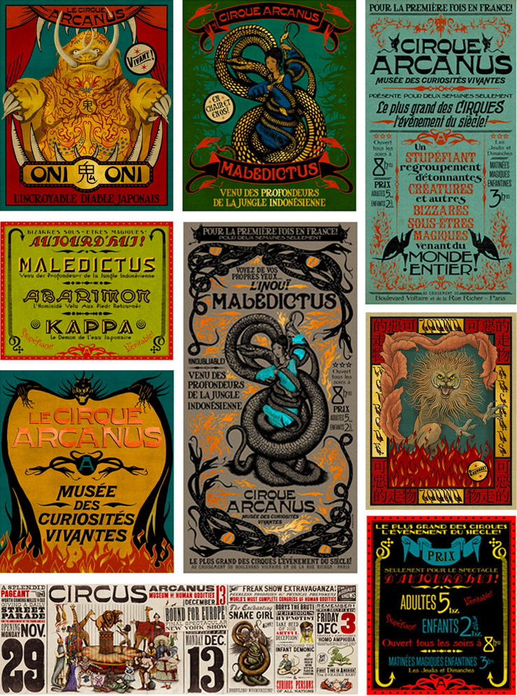
For an assignment like the Circus Arcanus sequence the team tried to embody the design ethos of someone who might be promoting a real-world circus. ‘Much of our work in posters is about selling something … [as] if you were employed to be a graphic designer to sell a circus.’ When choosing a colour palette and a typographic style the team thought about the ways in which visual cues might inform the audience’s perception. ‘We knew from the beginning that it wasn’t going to be a typical circus that’s uplifting and shiny and showy … it had a dark side to it,’ explains Mira. ‘You make decisions about colours and mood and typography — whether it was soft and playful or had a bit of an edge to it. All those things feed into your decision as a designer.’
Another unique element of MinaLima’s Fantastic Beasts graphic design thus far has been the chance to revisit graphical props from the Harry Potter films. Although it’s been over a decade since much of that work occurred, these new pieces exist years before their ‘Potter’ counterparts in Rowling chronology. The team had the chance to reimagine the Daily Prophet newspapers (alongside an American equivalent in the wonderfully punned New York Ghost), this time with a suitably turn-of-the-century flavoured masthead. The duo’s Ministry of Magic branding also feels period appropriate; it’s softer with delicate ornate embellishments. Says Mira, ‘it’s about trying to identify the flavour and the personality [of the time].’
‘[J.K. Rowling] described them all … I was writing furiously with my pencil!’
While the team had the seven Harry Potter books (and a trove of additional ‘Potter’ writing by Rowling) to help inform design decisions, Newt’s prequel world is an entirely new beast. In some cases, this was liberating: Miraphora and Eduardo had artistic and narrative freedom to decorate New York with a glorious assortment of magic-meets-Art-Deco posters, pamphlets and advertisements. Conversely, many graphic pieces in this new universe would touch uncharted ‘Potter’ canon. This was a significant challenge, but one the team tackled with style. Enter author-turned-screenwriter J.K. Rowling.
‘Sometimes the script might give us a few stage directions but we need to have more information about backstory,’ explains Mira. In places where design might stretch beyond existing Rowling canon (and fabricated names and illustrations won’t cut it), the author was able to expand her universe with exciting new pieces of ‘Potter’ lore. In Fantastic Beasts we learn briefly about Massachusetts’ Ilvermorny Castle, Hogwarts’ North American cousin. Recalls Mira, ‘I was designing the school logo. We didn’t have any information about Ilvermorny and I was kind of making up different animals for different houses.’ Fortuitously, Rowling was visiting the film set that day and unveiled a wealth of new detail. ‘She was like, “oh no no no no” and described them all … I was writing furiously with my pencil!’
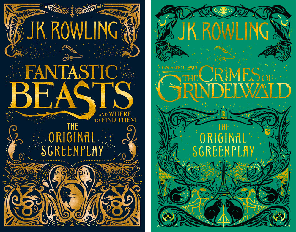
The team also worked with Rowling and her team to coordinate the design of artwork for the author’s original screenplays. Although there’s no published source material for Fantastic Beasts, Rowling’s scripts will be published in book form to accompany each cinematic release. MinaLima’s beautiful gold-embossed cover illustrations are decorated with an ornate collage of iconography from each film and transform Rowling’s text into gorgeous art pieces. ‘When we did the second one we really were conscious that we wanted people to go, “oh, is that part of that series?”,’ says Mira. ‘I feel like the second one was definitely an evolution of the first and I think it got better.’ ‘You kind of make a rod for your own back,’ adds Mira jokingly. ‘I need to make it even better for the next one.’
‘At least I don’t have to put on a face, otherwise I’d be giving things away’
If pre-production chatter is to be believed, Newt’s third adventure will see our heroes venture into further uncharted Wizarding World territory — Brazil. For Miraphora and Eduardo, a new world of creative challenges and choices await if indeed the zeitgeist of 1930s Rio de Janeiro serves as inspiration for a new design aesthetic. They won’t see a script until pre-production officially commences but are excited by the potential of a third prequel. ‘It depends on the content of the story and if there’s any sort of significant factors or locations that are going to help shape that,’ says Mira. ‘That’ll be interesting to see where it’s going to go.’
Until then, MinaLima’s bright light in J.K. Rowling’s Wizarding World continues to glow. Their London gallery is a must-visit attraction for fans of both the original Harry Potter series and the Fantastic Beasts prequels, and pop-up galleries across the globe ensure their craft is accessible to more of Harry’s worldwide fanbase. As for the task of protecting all these coveted Harry Potter secrets? Mira is relieved that she won’t know anything about Newt’s future until the duo read the finished scripts. ‘At least I don’t have to put on a face,’ she jokes. ‘Otherwise I’d be giving things away.’ Like a Hogwarts letter to a young witch or wizard, MinaLima’s invitation to help shape a new Harry Potter chapter is imminent.
Mira smiles.
‘We’re just waiting for our call.’
***
Want to see more of MinaLima’s amazing designs? Visit their online gallery and store to explore and purchase Harry Potter and Fantastic Beasts props. Fans in the UK can visit the House of MinaLima gallery at 26 Greek Street, Soho, London between 12pm-7pm every day.